Skoodio Navigation Design
The goal is to redesign the navigation of the Skoodio - an online video coaching and feedback platform

Design Process

Current header
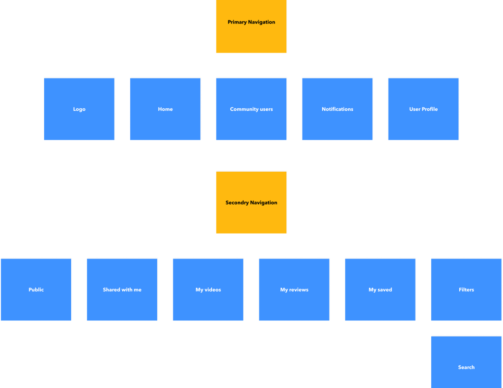
Current header structure
My views on header
The header is a strategic part of the website as the area that people see before scrolling the page in the first seconds of introduction to the website. Being somehow a sign of invitation, the header should provide the core information about the website so that users could scan it in split seconds.
After analyzing the structure, found the below issues.


Research I'd like to add here
The first thing to consider is eye-scanning models which show how users interact with a webpage in the first seconds
In an article about 3 design layouts, the author mentions the following common models:
Gutenberg Diagram, Z-Pattern, And F-Pattern.
by Steven Bradley on
February 7, 2011
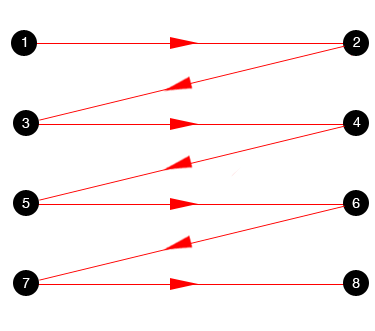
Guttenberg Pattern
F-pattern
Z-pattern
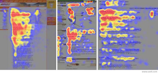
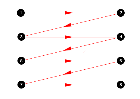
Guttenberg Pattern is quite typical for the web pages with the uniform presentation of information and weak visual hierarchy. As it can be seen from the scheme we found in Steven Bradley’s research, it marks out four active zones — and two of them go across the typical header area.
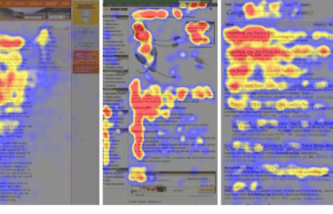
One more model is F-pattern presented in the explorations by Nielsen Norman Group and showing that users often demonstrate the following flow of interaction:
- Users first read in a horizontal movement, usually across the upper part of the content area. This initial element forms the F’s top bar.
- Next, users move down the page a bit and then read across in a second horizontal movement that typically covers a shorter area than the previous movement. This additional element forms the F’s lower bar.
- Finally, users scan the content’s left side in a vertical movement. Sometimes this is a fairly slow and systematic scan that appears as a solid stripe on an eye-tracking heatmap. Other times users move faster, creating a spottier heatmap. This last element forms the F’s stem.
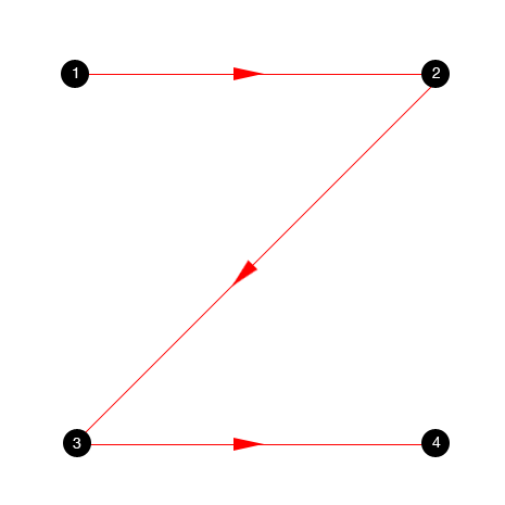
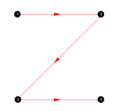
Another scheme features Z-pattern and the presented zig-zag version is typical for pages with visually divided content blocks. Again, the reader’s eyes go left to right starting from the upper left corner and moving across all the page to the upper right corner scanning the information in this initial zone of interaction.
All the mentioned models show that whichever of them a particular user follows, the scanning process will start in the top horizontal area of the webpage. Using it for showing the core information and branding is a strategy supporting both sides: readers scan the key data quickly while website gets the chance to retain them if it’s presented properly.
Another thing to consider is that the header can become a great help in presenting the essential data to the user quickly and providing a positive user experience via clear navigation.
Things to include in header
Brand identity
Quick Links to basic categories of website content
Search
Links to the most important CTAs
Brand identity : Logo
A study conducted by the NN/g found out that users would much easier remember those brands whose logos are placed on the left in comparison to the center or the right part placement.

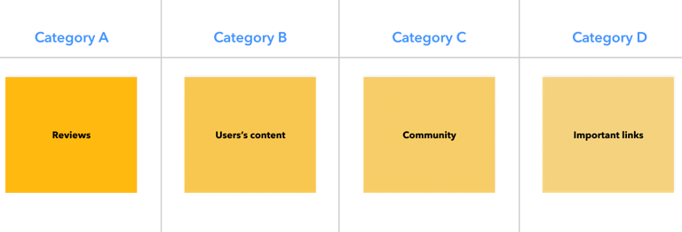
Affinity Mapping - Category Prioritization
Affinity Mapping - Category Content
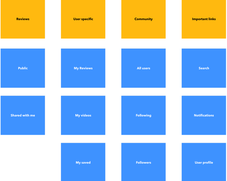
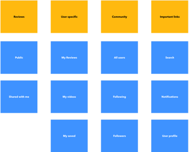
Card Sorting : Proposed Structure
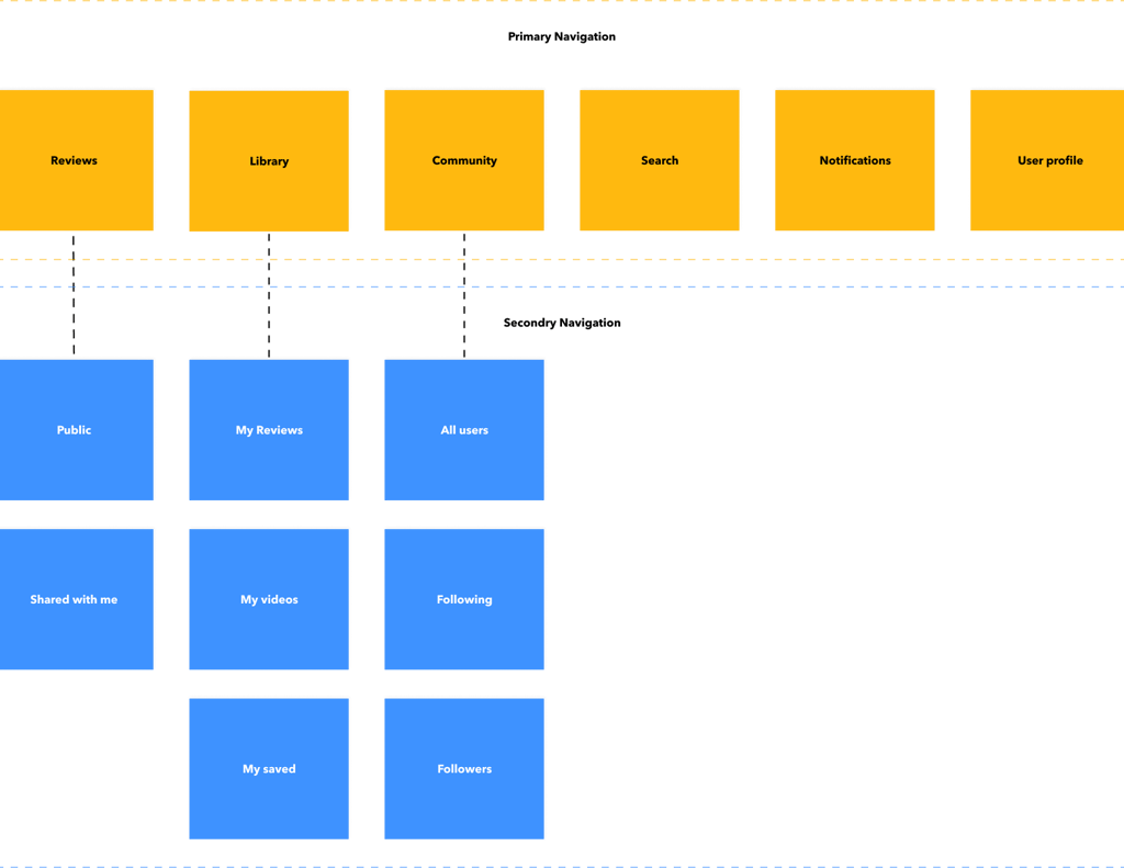
Design


Reviews tab

Library tab

