Netgear Meural Web Profile Menu Redesign
The goal is to redesign the user profile overflow menu as it is the part of the whole experience redesign

Design Process
Requirements
Story: CVG2-2273 - As a user I want a clear navigation layout of my profile info.
1. Your Library - (Not included today)
- Recents (perhaps rename to All Photos) the PLMs & team can decide.
- Playlists (this will include Shared Playlists *use a visual indicator that the playlist is shared)
- Artwork
- Favorites
- Purchases
2. Legal terms and conditions
3. Privacy Policy (US)
4. Log out (of your Meural account)
5. Find a Store
6. Help Center
7. Download the Meural app (iOS and Android)
8. Canvases:
- Add a Canvas (users cannot add a canvas without the Meural app, but they can register their canvas on my.meural)
Description:
Current Profile Menu
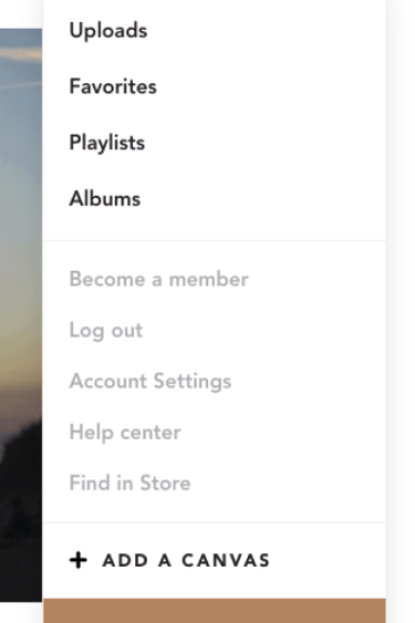

Current Profile Menu Structure
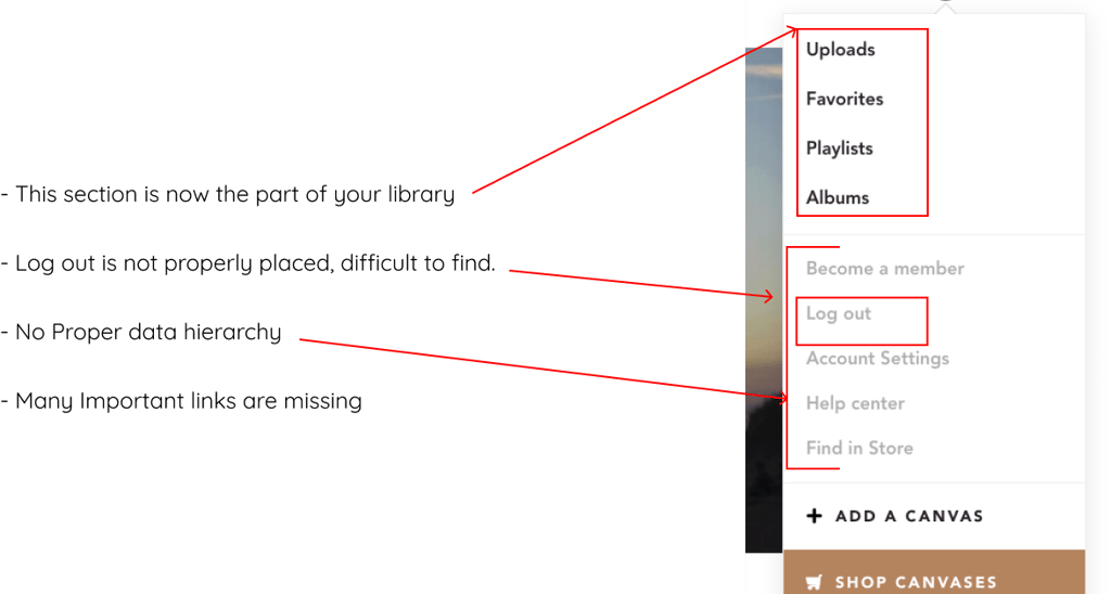
After analyzing the structure, found below issues.
Research
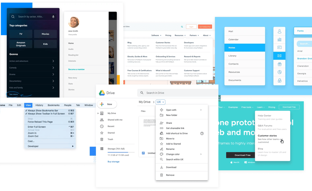
The first thing that comes to mind is, we see dropdown menus everywhere. But what makes a good dropdown?
To understand this, I researched the popular websites/Softwares dropdowns and analyzed the Meural partner websites and apps.
After research, found multiple missing items
Missing legal information links, as the website is “Footer less”
No links to download the mobile app
Notification items such as Schedules and invites are missing.
No proper explanation of Membership
Missing device, event, and user-related actions
No links to subscribe to a newsletter
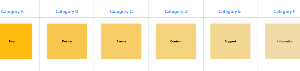
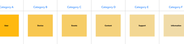
Affinity Mapping - Category Prioritization
To organize and prioritize the information from research, Actionable items are divided into six categories.
- User
- Content
- Device
- Events
- Support
- Information
Categories are prioritized with (A-Z) With A is highest
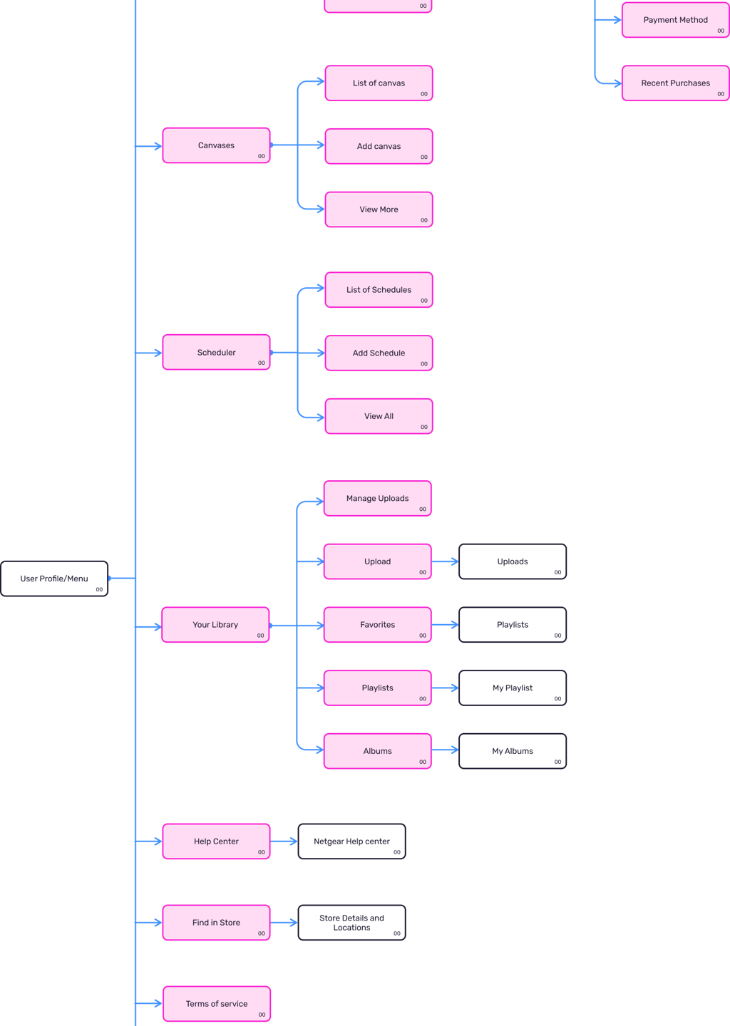
Affinity Mapping - Category Content
After category prioritization, the next step is to find the useful actionable elements for each category, to do this we used Affinity mapping and card sorting.
-Yg2PEvz5exfWr9yL.png)
-Yg2PEvz5exfWr9yL.png)
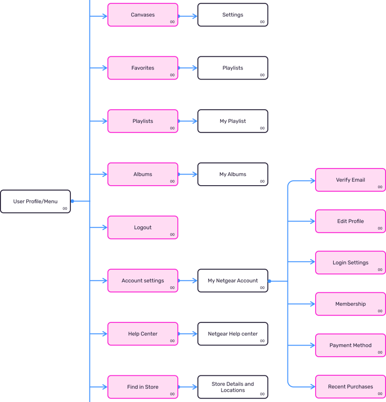
Proposed Menu Structure - IA

Wireframes
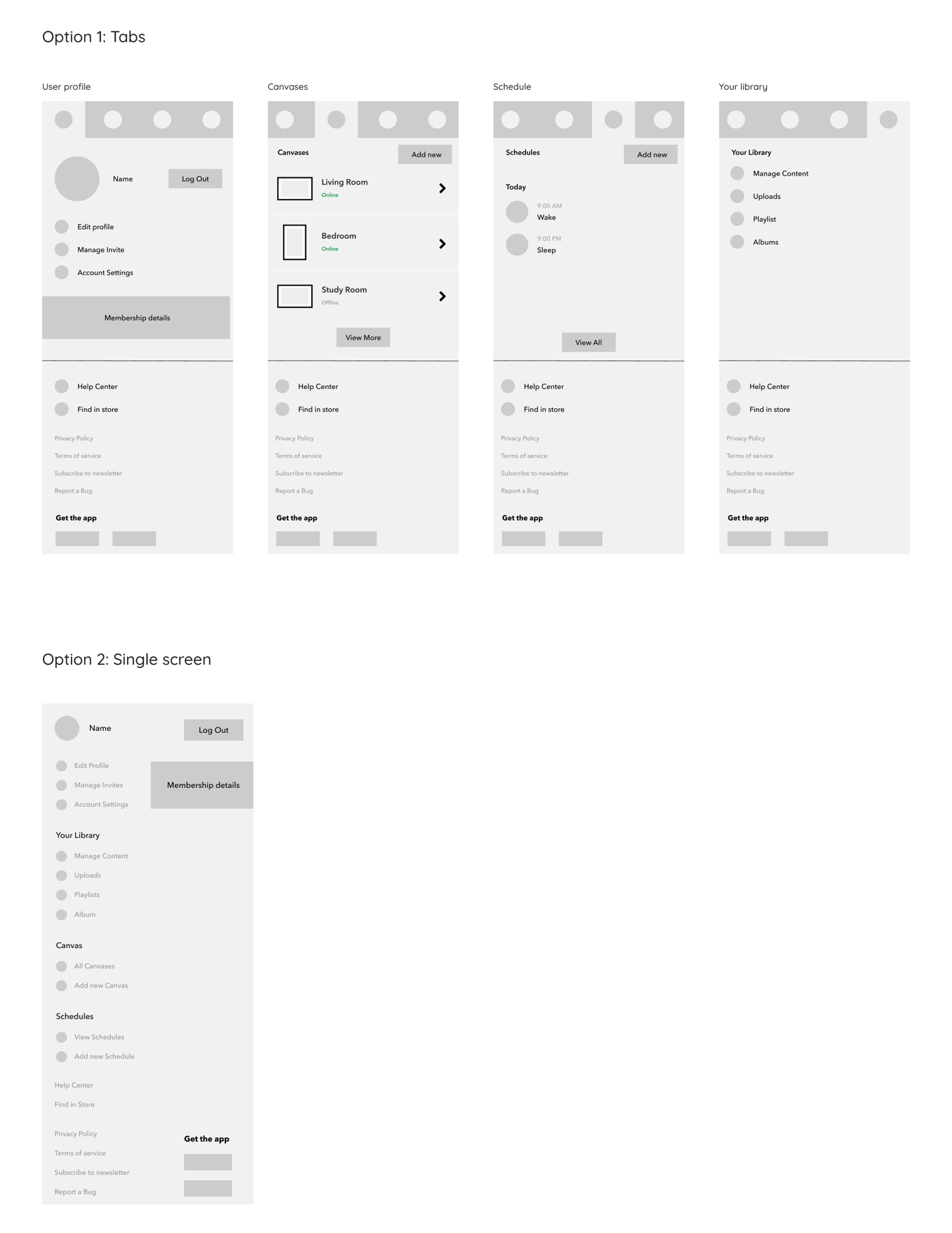
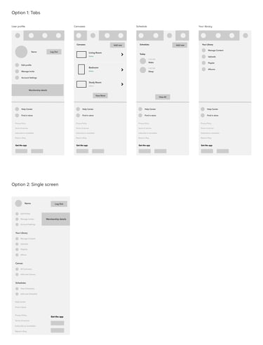
I created two options for it, one with tabs and another is a single-page solution.
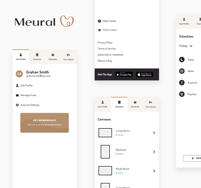
Design
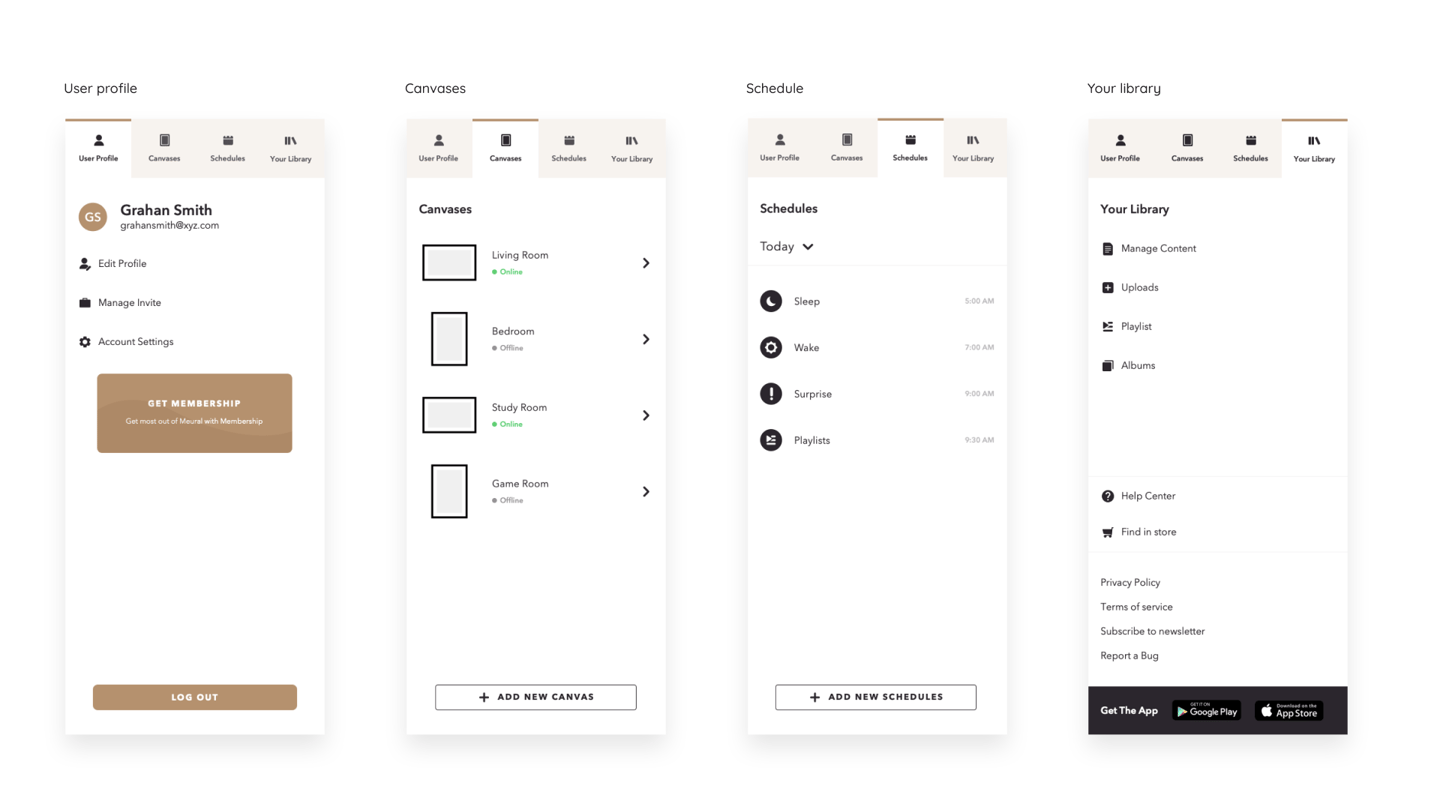
The tab solution was finalized and we created the visual design of it.