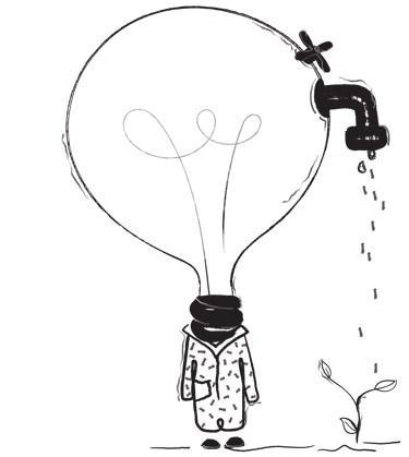
Orbiits
The company wishes to undergo a complete rebranding cycle to enhance its online presence by creating a customer-centric solution. It wants to be a one-stop interior design destination for custom and ready-made curtains as well as other window treatments.
Duration
8 Weeks (Dec 20 - Jan 21)
Team Size
2 People
My Role
UX Designer
Requirement gathering, Affinity mapping, User flows, Information architecture, Wireframes, Interactive prototype
The Curtain Company is a window treatment, drapery hardware, and fabric company that follows a B2C and B2B business model.
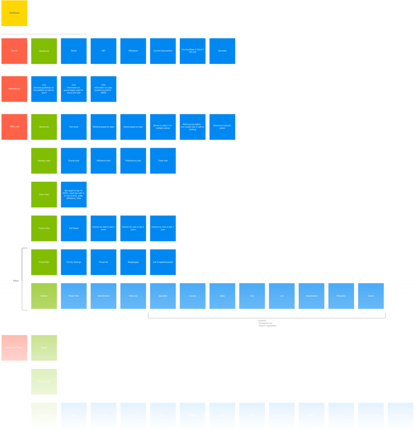
Big Data Saas Product
Objective
CASE STUDY
Project Overview
Challenges
When we were first introduced to Orbiits, it was still in nascent stages being just a black-and-white application violating the usability benchmarks. We recommended a complete UX overhaul, so it can be transformed into a usable, data-rich goldmine for HCPs that the founders envisioned. Here’s the list of challenges that were ahead of us.
Being a typical big data application, properly categorize and present data for KOLs
Amalgamate all the different filters available into one and place it centrally
Design new features using data vis. techniques to gain a competitive advantage
Ease the appointment booking process for HCP personnel as it’s a day-to-day task

Solutions
First, we started by understanding what the application does and what the mental model of the target audience is, we did this with the help of stakeholders through multiple demo calls of their current work process.
Here is the list of solutions that we came up with after understanding the product:
Creating the IA of the current solution and finding the usability gaps
Creating User flows
Creating new Information architecture
Sketching Wireframes
Crafting Hi-Fi UI mockups
Interactive prototype
Design Approach: Double Diamond Process
As we are doing the complete UX overhaul of the current product, finding the usability gaps, and fixing them with the new design, we found Double diamond UX process as the best fit to initiate this project, different UX processes have different components in it, keeping the budget and timeline in the mind we have circled out the things that we are going to implement in this project.
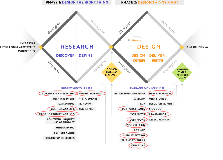
Stage 1
Research: Discover & Define
To understand the product and the user, we started this stage with:
1. Stakeholders interviews
2. Business analysis
3. Existing product analysis
Stakeholders Interview
We started with the demos of the current solution by stakeholders, we asked as many questions as possible to understand the product and the domain. Later we mapped all those insights with the help of the Affinity diagram, which helped us a lot in designing the layouts in the later phase.
Existing Product Analysis
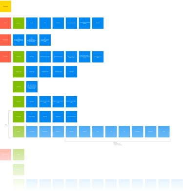
To understand the existing solution and to find the usability gaps in it, we started with creating information architecture of the existing design. This exercise helped us a lot to dive deep into the design, later we found major usability gaps, dead ends, loops, and unwanted clicks.
Existing IA
Stage 2
Design & Deliver
In this stage we are going to do:
1. User flow
2. Lo-Fi Wireframes
3. Style Guide
4. Hi-Fi Mock-ups
5. Prototype
6. Usability Testing
User Flows
We started converting the insights which we pasted in affinity mapping and the issues in the existing IA to user flows, it helped us in defining each step the user would have to take to interact with our product. It also assisted us in keeping ourselves focussed on designing to simplify the users’ day-to-day tasks.
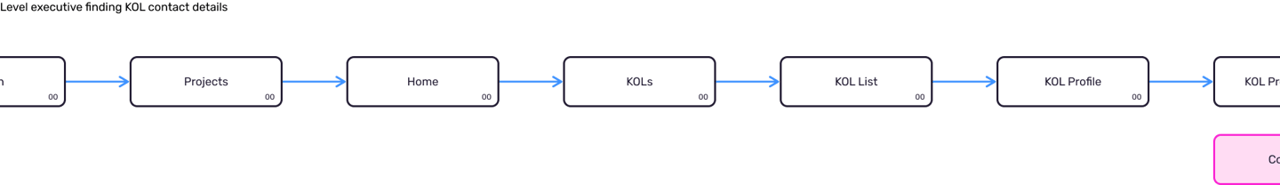
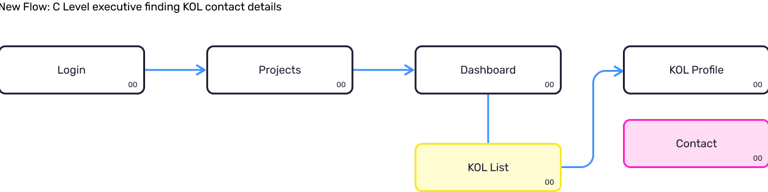
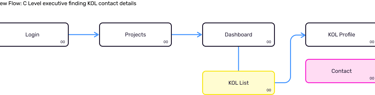
One of the frequently used actions in the app - Finding KOL contact details, Below is the comparison of existing vs newly designed flow
KOL = Key opinion leader
Key opinion leader (KOL) is a trusted, well-respected influencer with proven experience and expertise in a particular field.
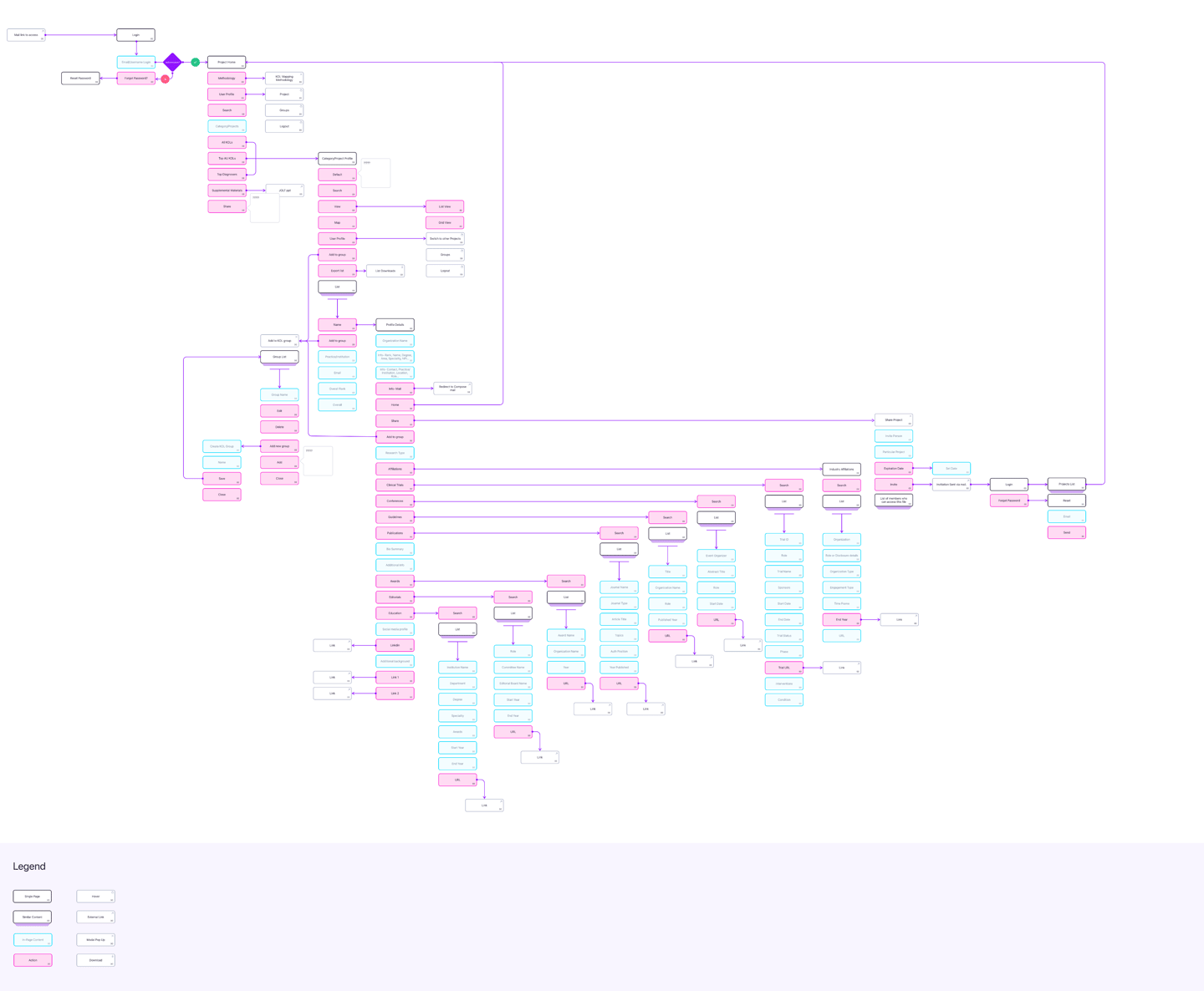
Information Architecture
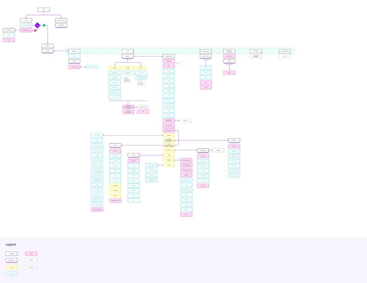
After freezing the user flows, now is the time to do my favorite UX exercise: Information architecture, some of the featured are recategorized to make them easier to find.
New IA
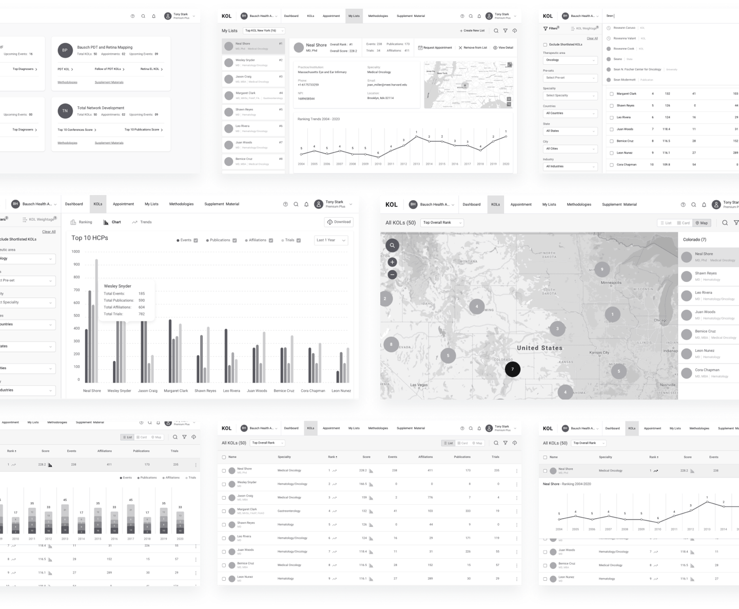
Wireframes
Once the blueprint was all set, we started converting those to wireframes, after multiple brainstorming sessions and A/B testing of several layouts which majorly include widgets, we started sharing those with the stakeholders on the weekly basis.
Style Guide
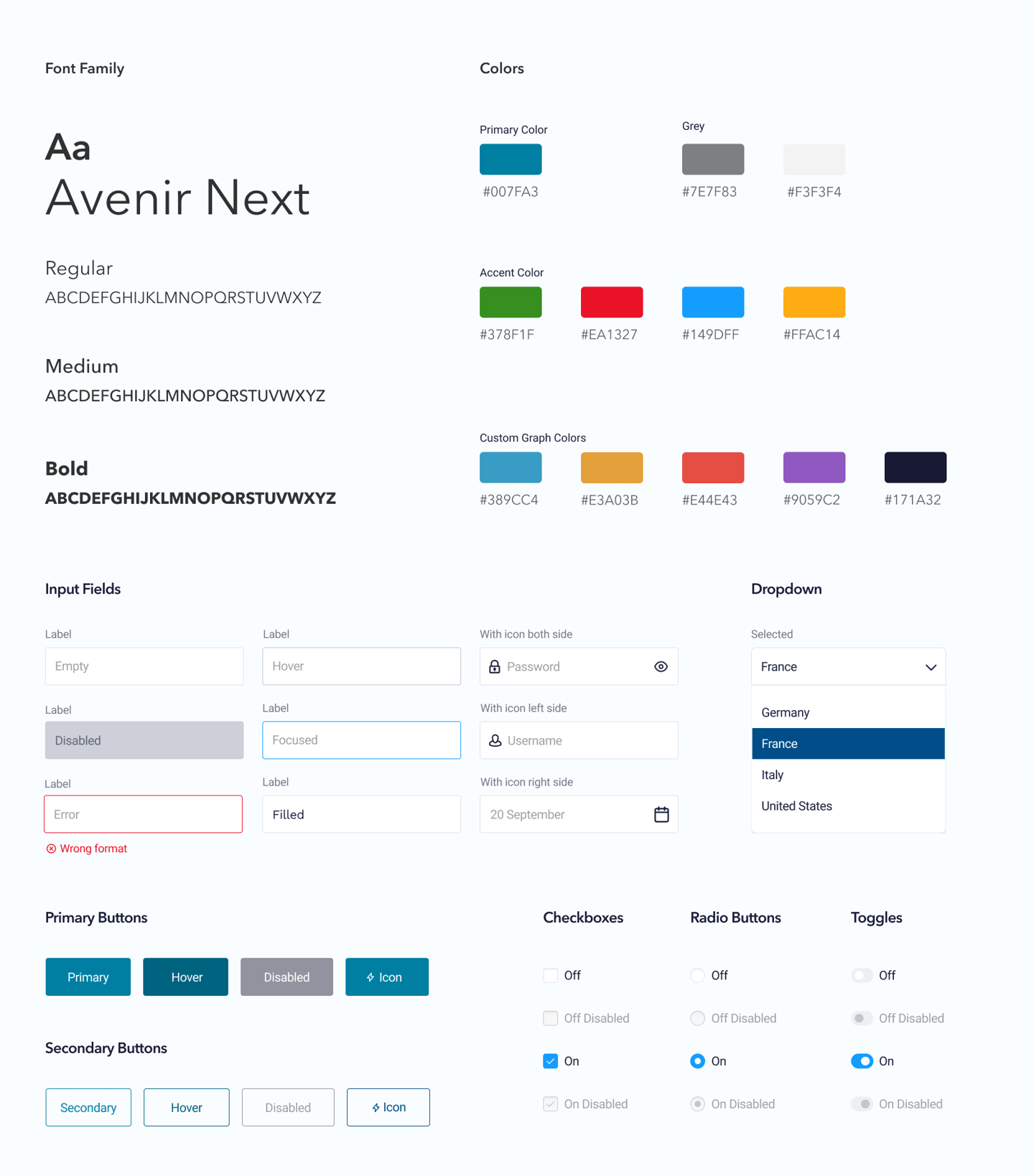
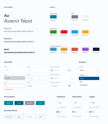
After the approval of wireframes, this was the time for the final UI design, but before jumping into that, we started defining the style guide with the help of Atomic design principles, this style guide consists of several reusable components that can be used to design layouts.
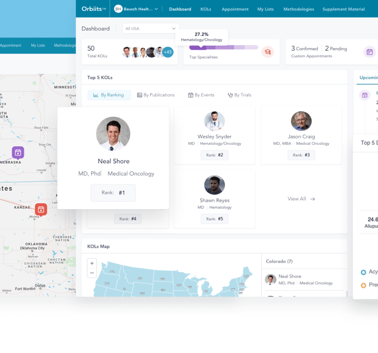
Final UI Design
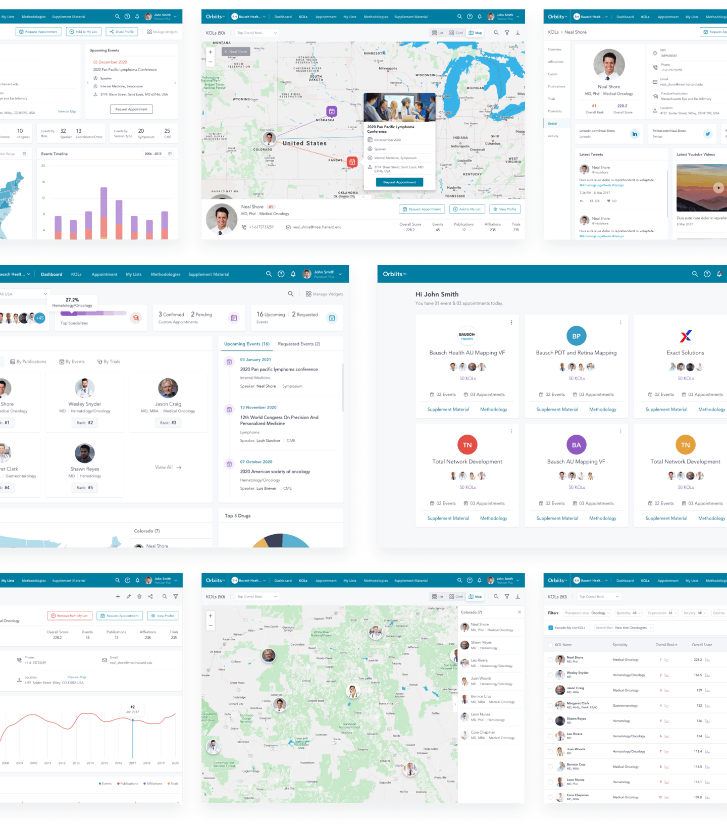
The Atomic design library which we prepared helped us create the layout quickly and efficiently, along with the consistency throughout our designs.
Interactive prototype


To test these freshly crafted mockups, we created Invision based prototypes, adding every possible detail and interaction.
Usability Testing
We forwarded these prototypes to the larger audience in the Jolt, and some of the executives who are going to use this product - the end-users.
This was a self-recorded usability test, and after analyzing those recordings, we got a piece of good news as there were only a few minor updates in the design related to UI elements, and they are happy with the solution.
We implemented their feedback in the design, and started preparing for the developer hand-off.
Developer Hand-off
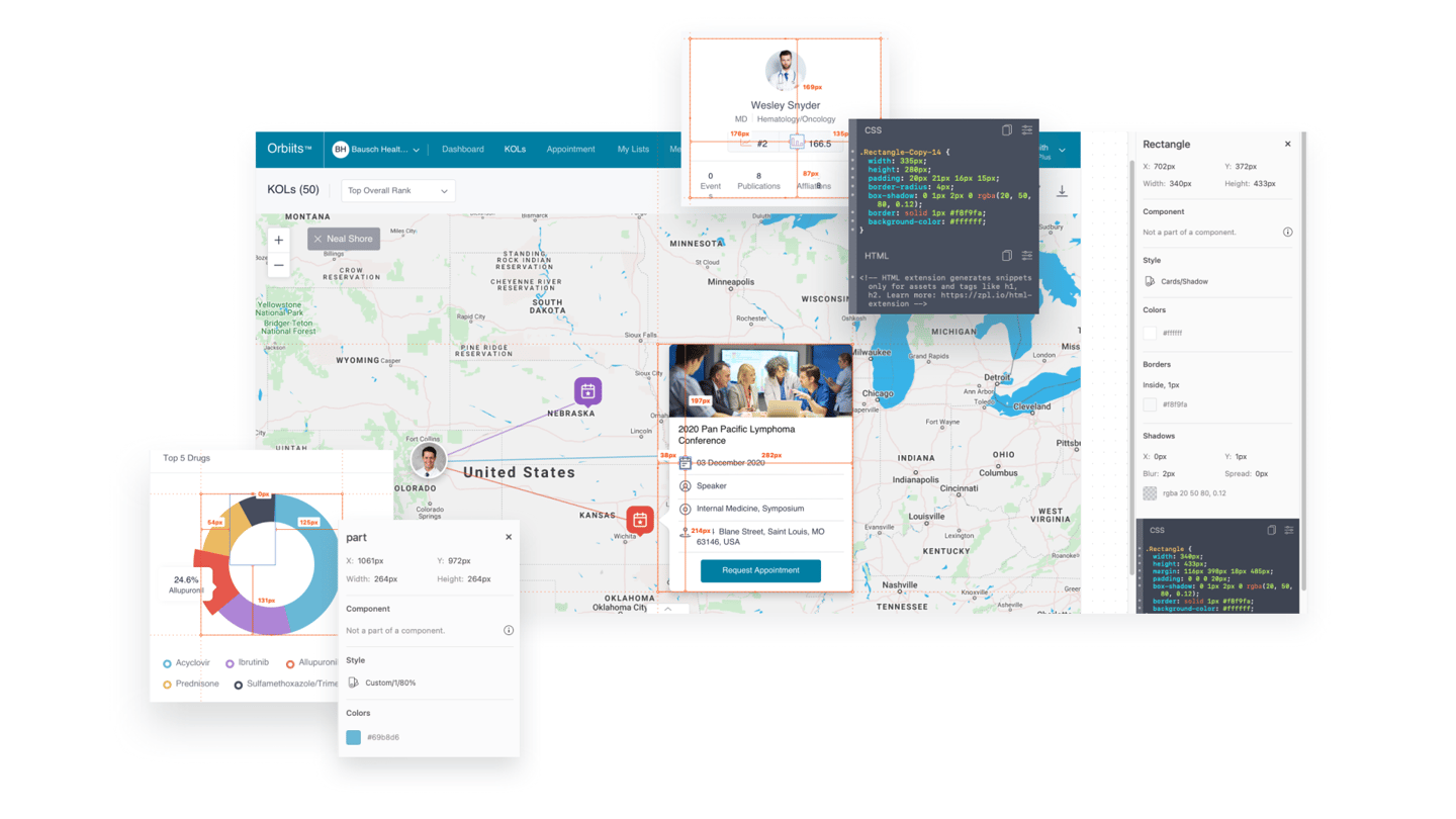

Approaching the closure of the project, we prepared for the handoff by taking care of the redlining of the designs and related niceties.
Accessibility compliance
We have planned accessibility testing for the next phase of the project, in which we are going to check and fix the accessibility issues and introduce new features in this product.
We usually do that in two phases, first phase is an automated test using tools like UI Automation, Automated Accessibility Testing Tools (AATT), Dynomapper, etc.
After fixing the issue found in the first phase, we start the second phase in which we do it manually by creating a checklist of WCAG(Web Content Accessibility Guidelines) guidelines.
What I learned
W