NETGEAR Meural
NETGEAR wanted to give a complete refresh and introduce some new features to the newly acquired product - Meural. The objective is to upgrade the overall experience making it more intuitive and easy to use.
Duration
4 Months (Jan 2020 - June 2020)
Team Size
6 People
My Role
UX Designer
Requirement gathering, Affinity mapping, User flows, Information architecture, Wireframes, Interactive prototype
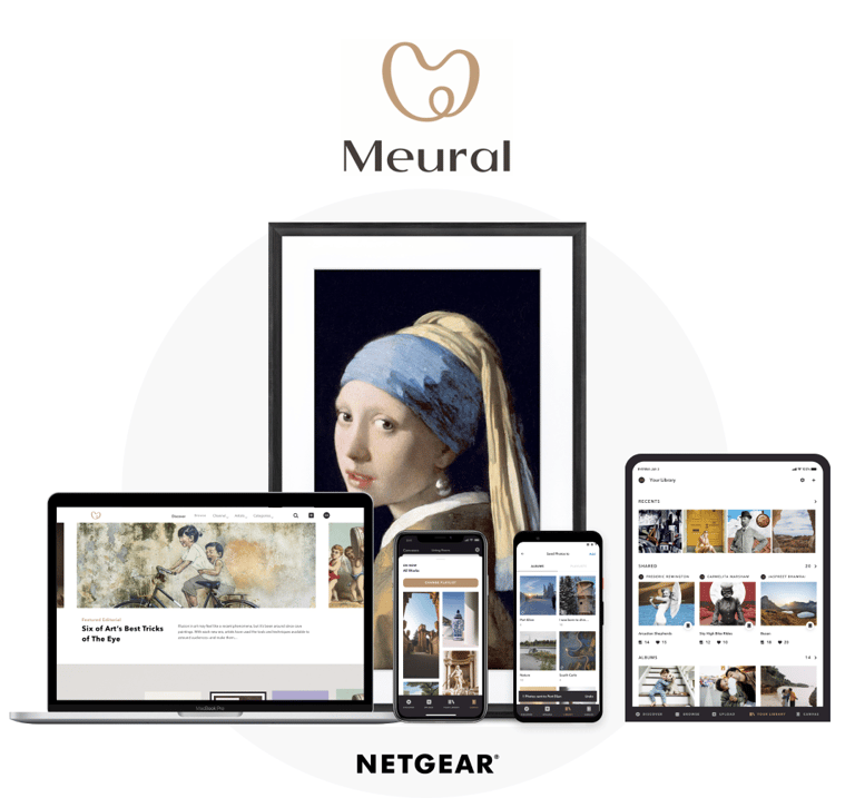
A subsidiary of NETGEAR, Meural is an American technology company whose principal product is the Meural Canvas - a smart art frame, it can showcase artwork and photography—both Meural- and user-provided.
IoT, Web, Android & iOS app
Objective
CASE STUDY
Project Overview
Challenges
Meural canvas is usually regulated by the Meural companion app. The idea was to socialize the canvas by adding new features, refreshing the aesthetics, and eliminating the UX inefficiencies.
The current app’s interface is cluttered and has multiple design elements competing to attract the user's attention simultaneously.
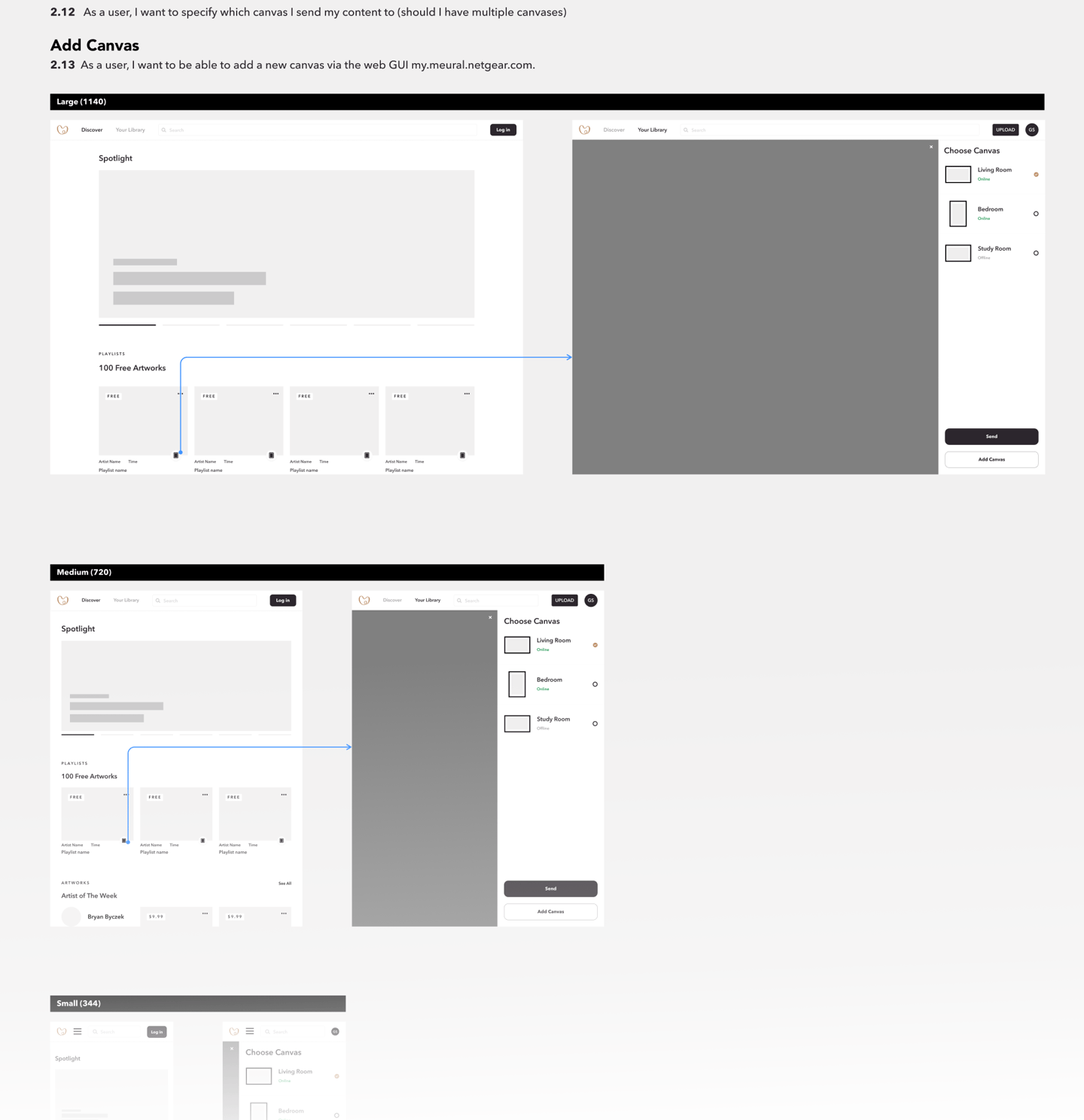
One of the key functionalities of the app that lets users send photos from the phone to display over the canvas was a bit complex.
There was no clear distinction between what’s free & what’s paid stuff. This has irked the Meural users for a long time.
There were external links opening within the app which caused confusion & frustration, tappable elements didn’t seem so. We took up the challenges to help Meural appeal to a larger market chunk, a segment that’ll use Meural canvas to display family pictures to their grandparents, thus evoking positive emotions.


Solutions
We started with the basics and did a thorough heuristic evaluation of the existing Meural app. We used the “How Might We” exercise to look for solutions to problems discovered, and then moved on to creating wireframes as per the user stories. In the ideation stage, we carefully ruminated over the placement of each & every design element over all the screens to reduce existing design clutter. By the end of the exercise, we were left with wireframes that transitioned into a simple, aesthetic UI for the app.
Feature integrations - The 'socializing feature' that lets users add peers into playlists is designed effortless and stimulating, thereby motivating users to perform the intended action. Meural app would now allow users to censor content, easily personalize things, and more. We eliminated the other UX issues and simplified the app, providing users with a rich experience overall.


Design Approach: Lean UX Process
As we are redesigning the experience with a tight deadline and the goal is to improve and refresh the experience we decided to go with the Lean UX method: think-make-check.
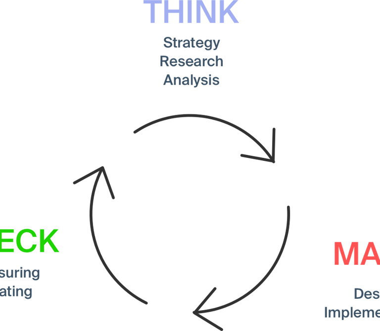
Stage 1
Think
As the goal is to refresh the entire experience and introduce new features we started with
1. Brand and user understanding
2. Existing product analysis
3. Current problems users are facing
4. New features analysis
Heuristic Analysis
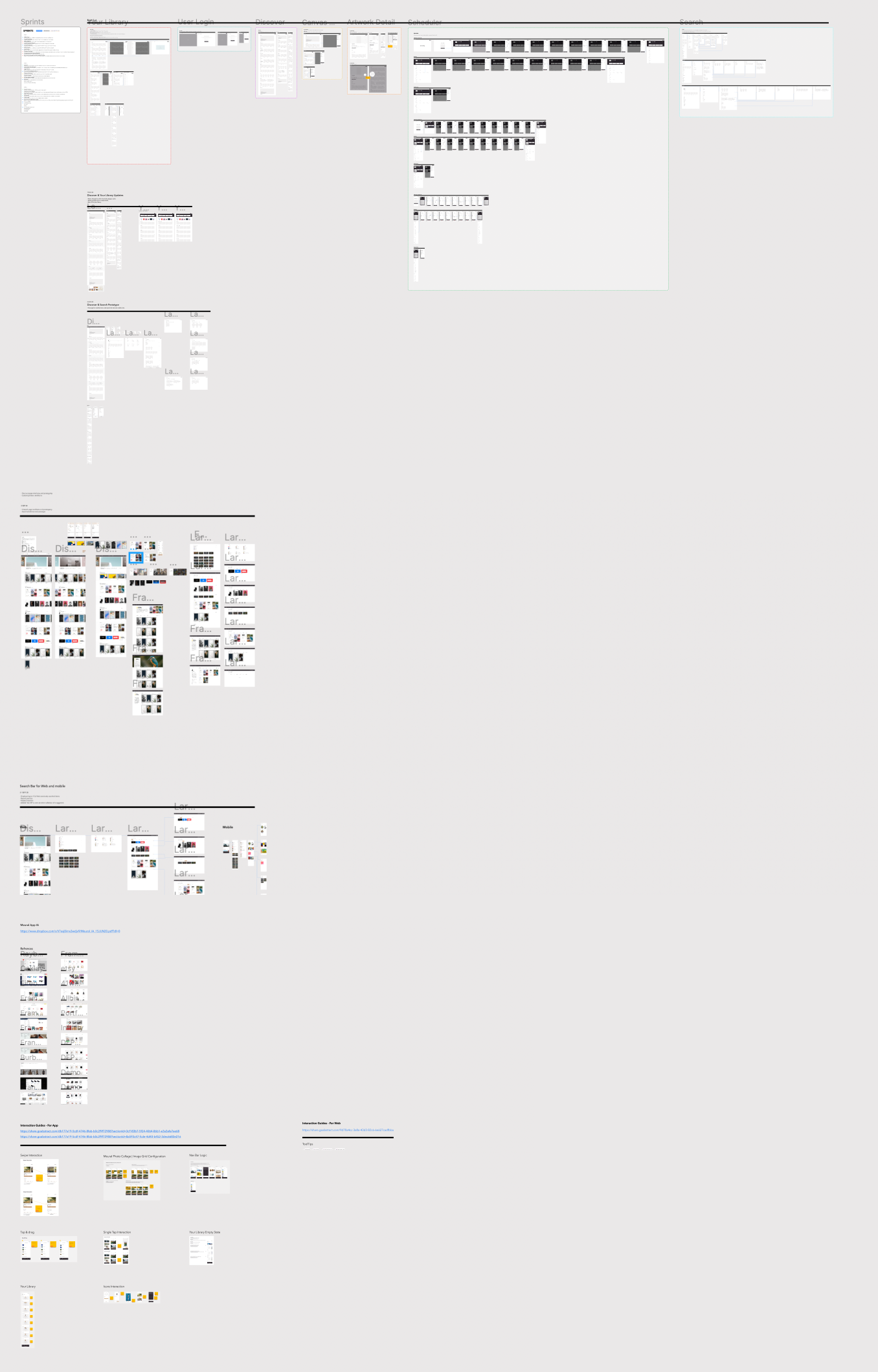
We started with the demos of the current solution by stakeholders, we asked as many questions as possible to understand the product and the domain. Later we mapped all those insights with the help of the Affinity diagram, which helped us a lot in designing the layouts in the later phase.
Existing Product Analysis
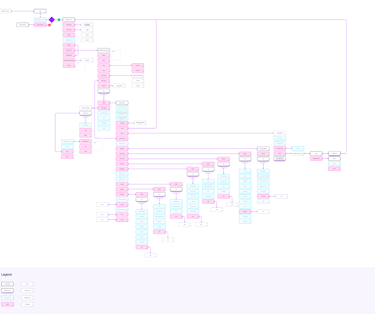
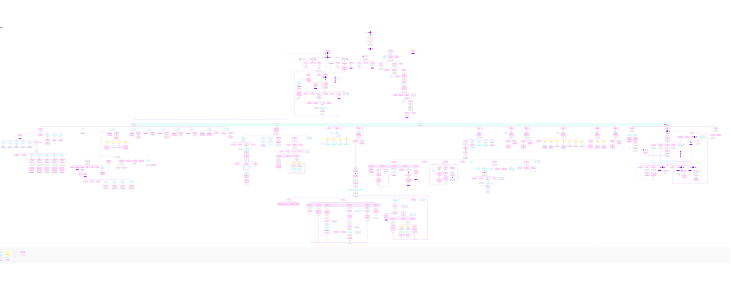
To understand the existing solution and to find the usability gaps in it, we started with creating information architecture of the existing design. This exercise helped us a lot to dive deep into the design, later we found major usability gaps, dead ends, loops, and unwanted clicks.
Existing IA
User Research
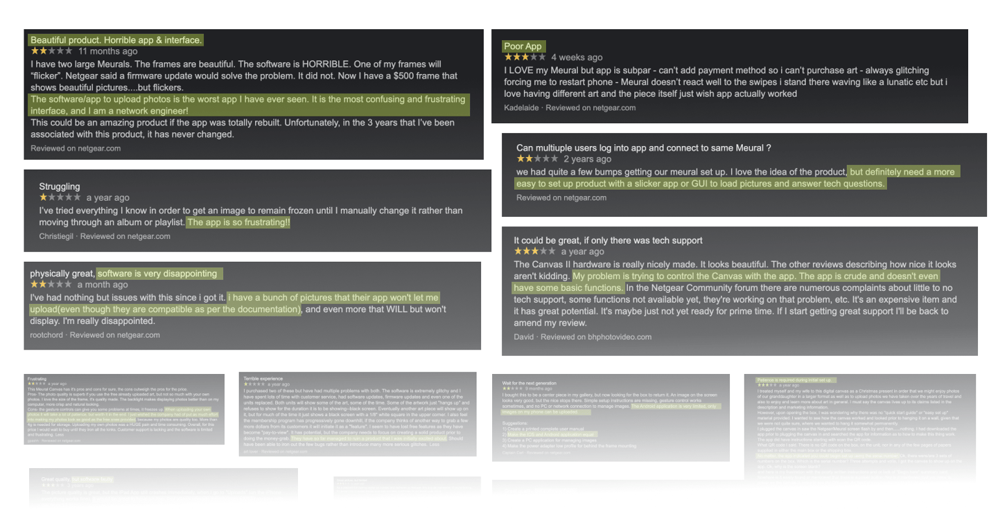
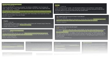
The main concern of Netgear was the bad reviews and ratings for the digital experience, customers are complaining about the app experience on the app store, Google, Netgear, etc.
We started analyzing these reviews throughout the internet, and we extracted a list of problems users are facing from that data.
Sometimes it is very difficult to understand the user interafce
Difficulty in managing multiple canvases at a time.
Difficulty in understanding what is free and what is paid
Difficulty in buying and understanding benefits of membership.
Frustrating to see buy screen after tapping send to canvas button.
Difficulty in buying another canvas through app.
There is no option to censor content.
App sometimes opens external links which is frustrating and confusing.
Sometimes it is confusing that which element is tappable and which is not.
Unable to know the exact meaning and purpose of Navigation tabs.
Difficulty in monitoring the content playing on canvas.
There is no option to comment on works.
Difficulty in personalising the things.
Difficulty in saving a work or playlist offline.
Unable to filter content according to choice.
Insights
How might we statements
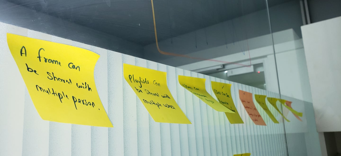
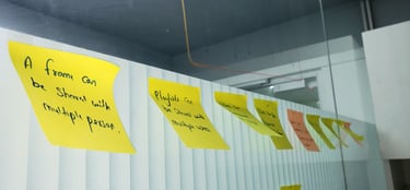
We have the list of problems and challenges we gathered in previous stages, now is the time to generate creative solutions, we started pasting solutions on the wall, later we shortlisted a few solutions, and moved to the brainstorming stage.
We brainstormed on each shortlisted solution in detail before jumping into wireframes.
Stage 2
Make
After getting a good idea about the problems users are facing, usability gaps, and possible solutions, we are all set to move into the "Make" phase.
This stage consists of -
1. User personas
2. User stories
3. User flows
4. Information architecture
5. Wireframes
6. Style guide
7. UI mockups
8. Interactive prototype
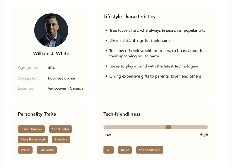
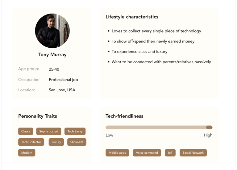
User Persona
Based on the targeted audience and the user data provided by Netgear, we defined user personas which helped us to understand the behavior of the targeted users.
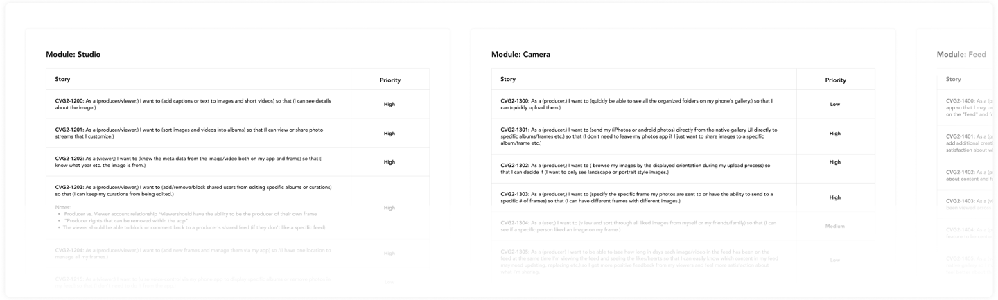
User Stories
We started collaborating with the UX designer from Netgear and the facilitator to identify the modules and prepare user stories. After approval of user stories, we started pasting them on Jira as a ticket.
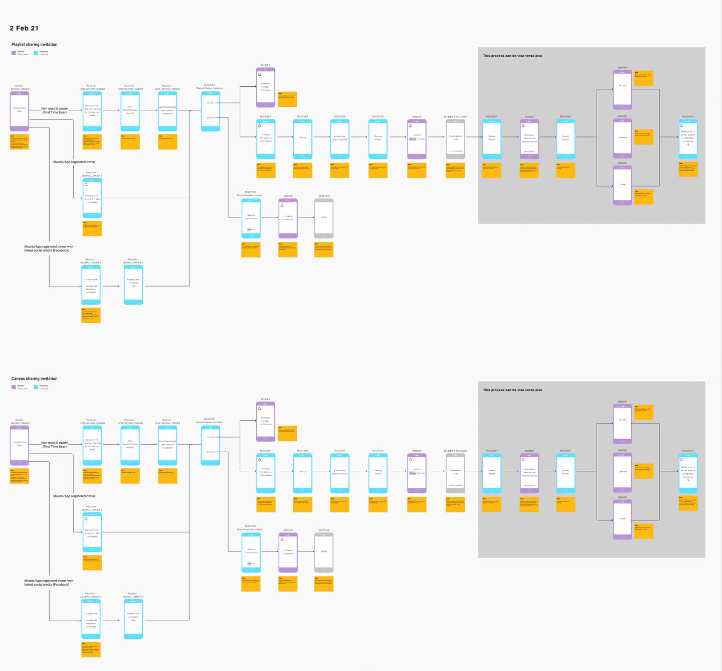
User Flows
We started converting the insights which we pasted in affinity mapping and the issues in the existing IA to user flows, it helped us in defining each step the user would have to take to interact with our product. It also assisted us in keeping ourselves focussed on designing to simplify the users’ day-to-day tasks.
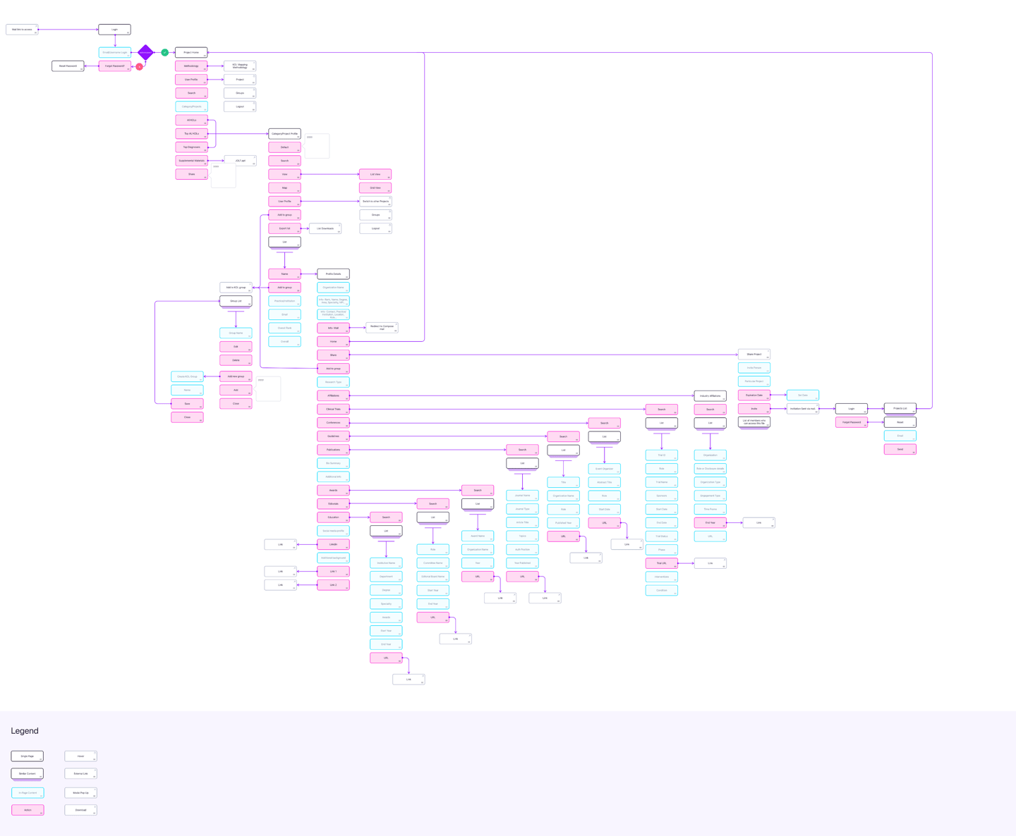
Information Architecture
After freezing the user flows, now is the time to do my favorite UX exercise: Information architecture, some of the featured are recategorized to make them easier to find.
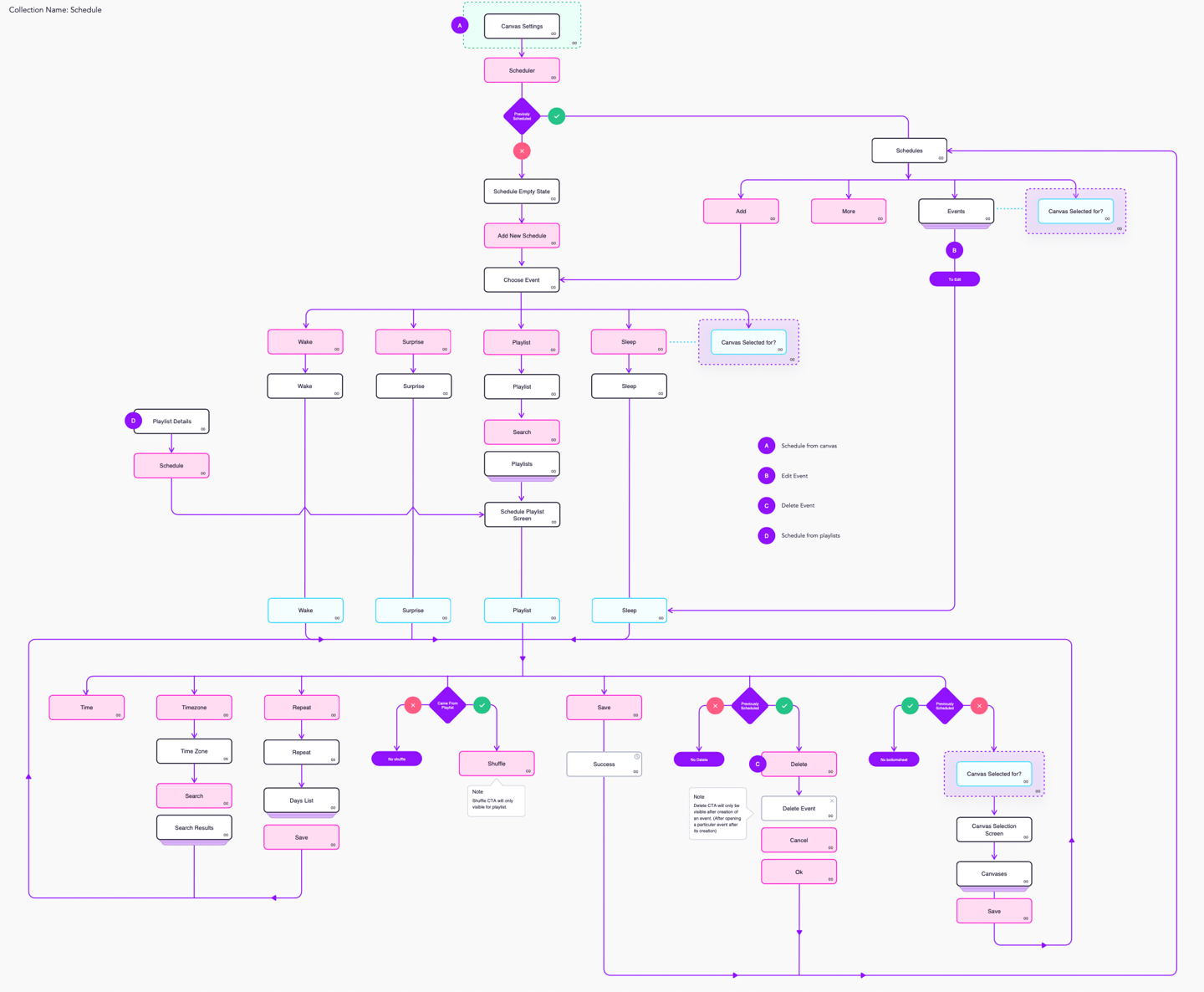
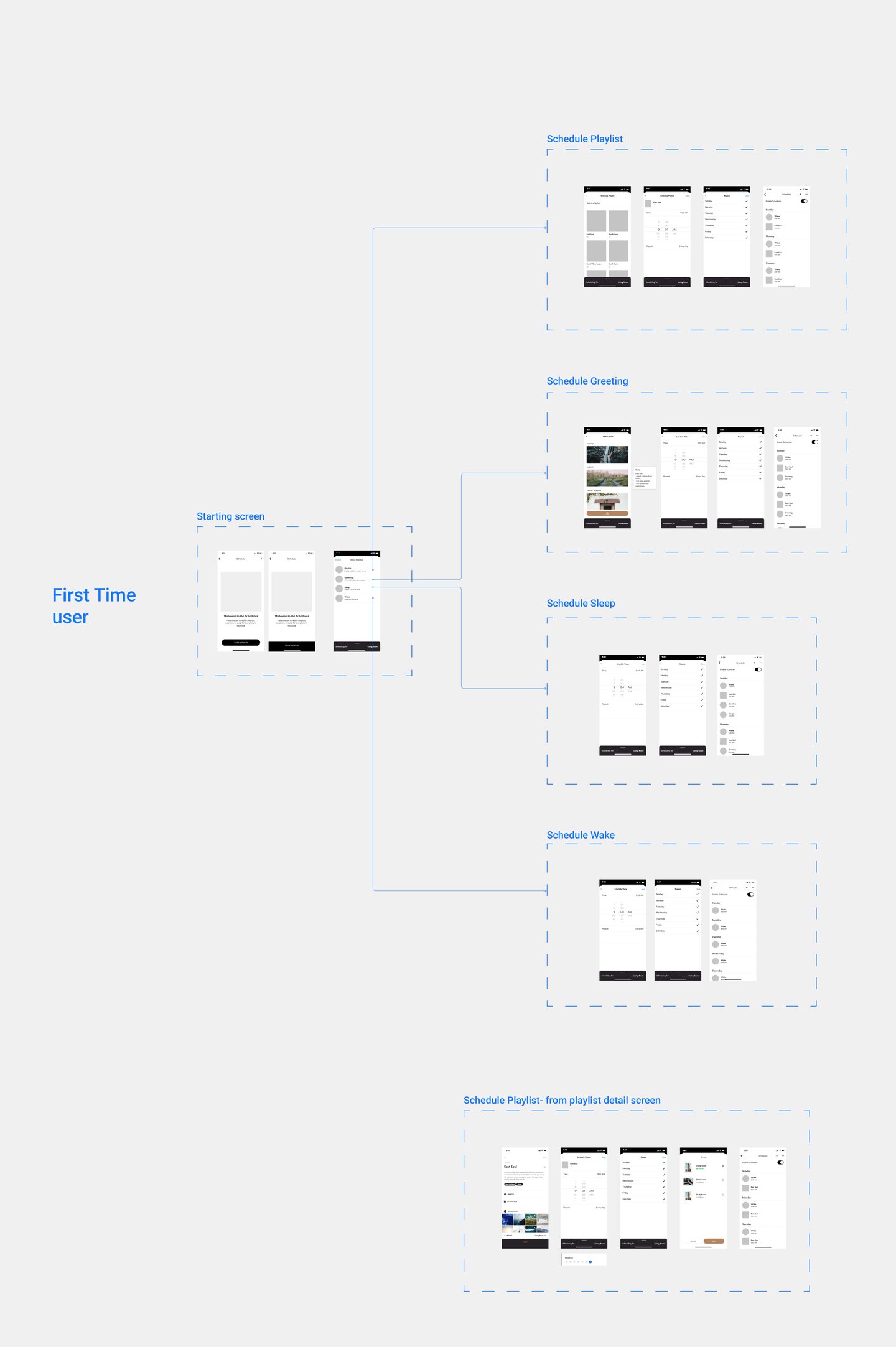
Canvas Setting: Scheduler
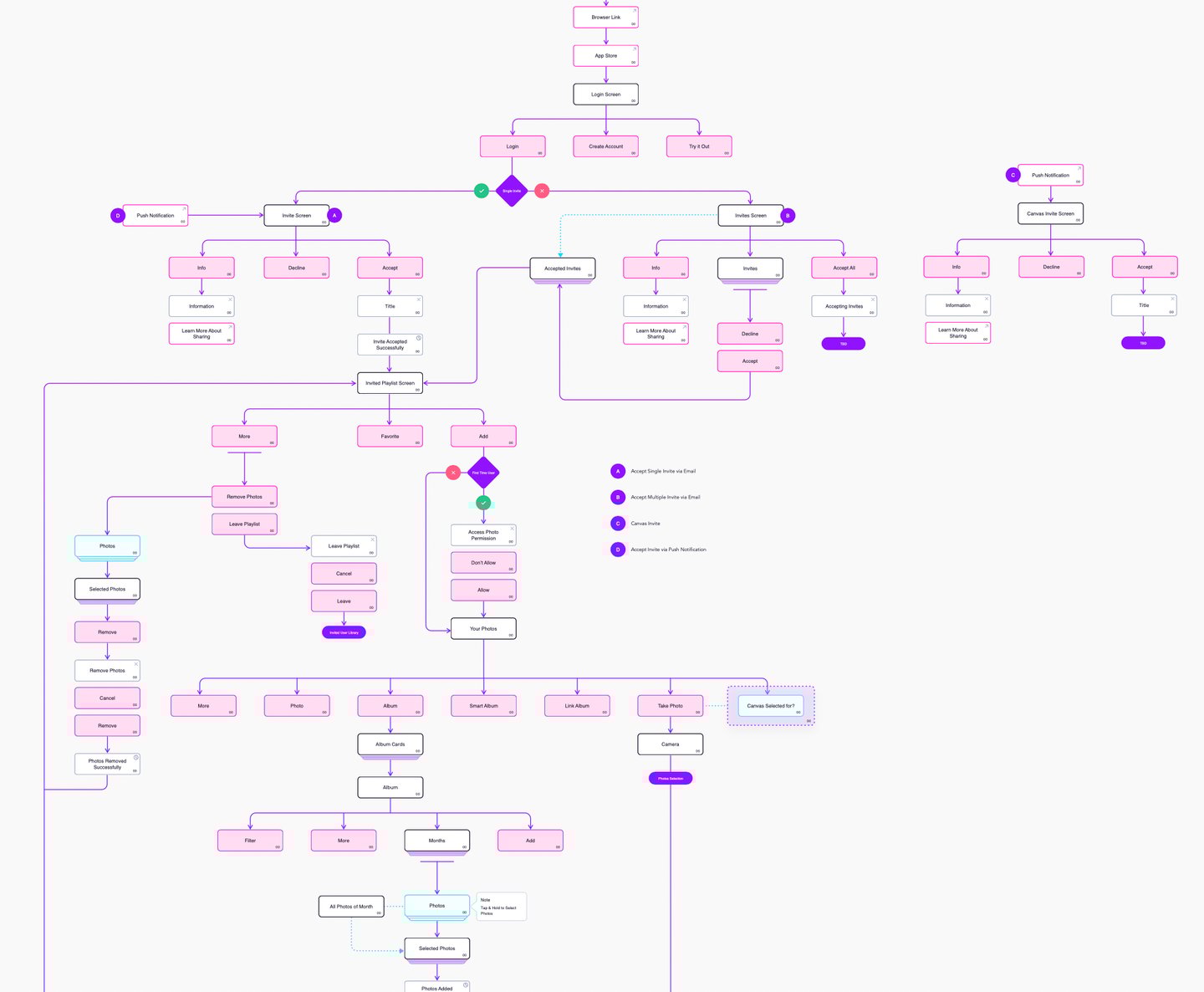
Invited Playlist
Meural app IA
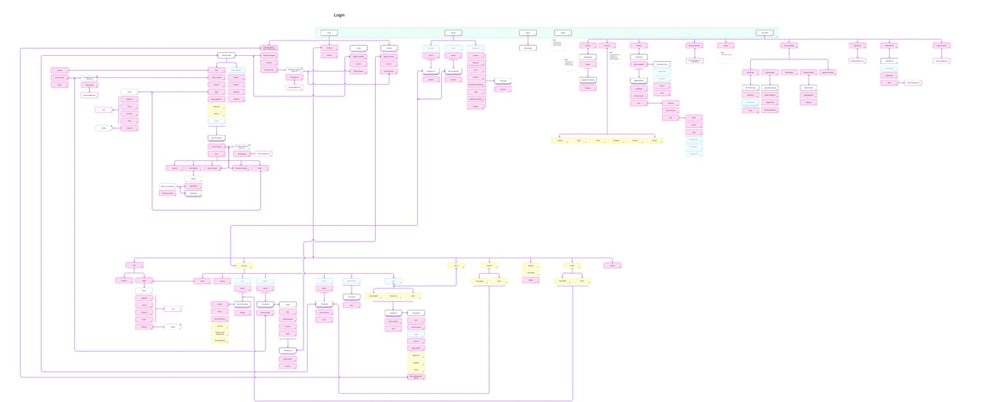
Meural web IA - registered user
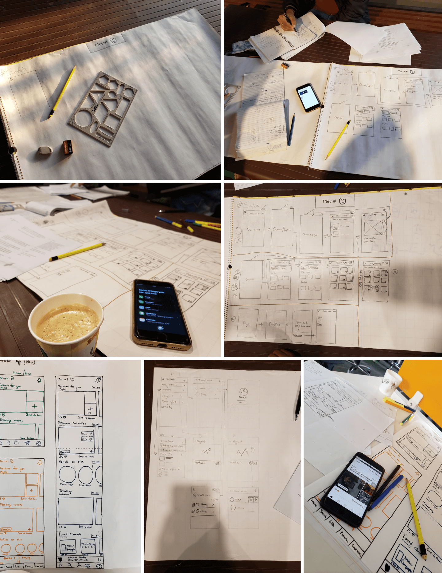
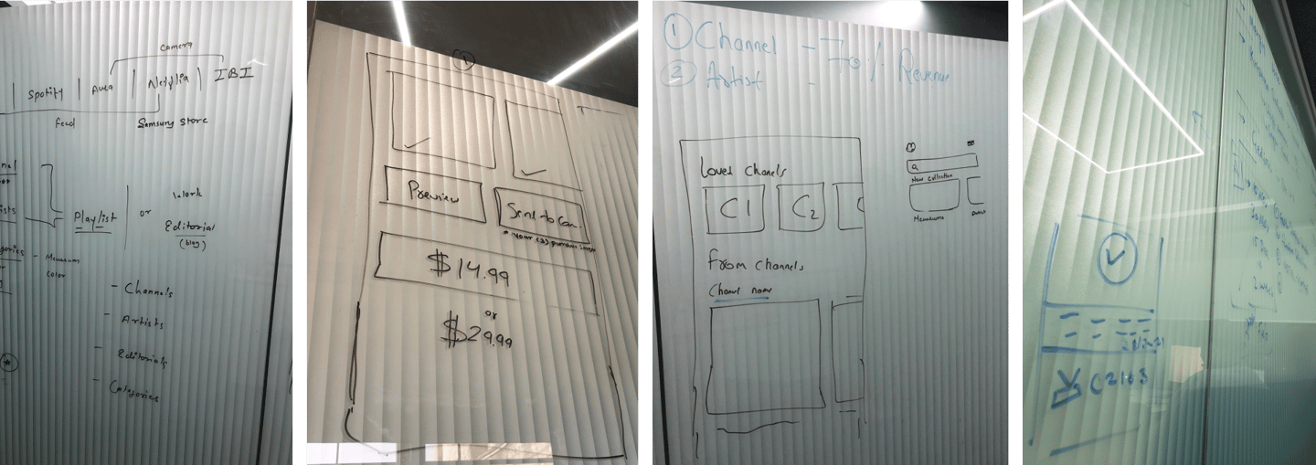
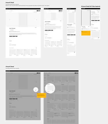
Paper Wireframes
Once the blueprint was all set, we started converting those to wireframes, after multiple brainstorming sessions and A/B testing of several layouts which majorly include widgets, we started sharing those with the stakeholders on the weekly basis.
Wireframes
Once the blueprint was all set, we started converting those to wireframes, after multiple brainstorming sessions and A/B testing of several layouts which majorly include widgets, we started sharing those with the stakeholders on the weekly basis.
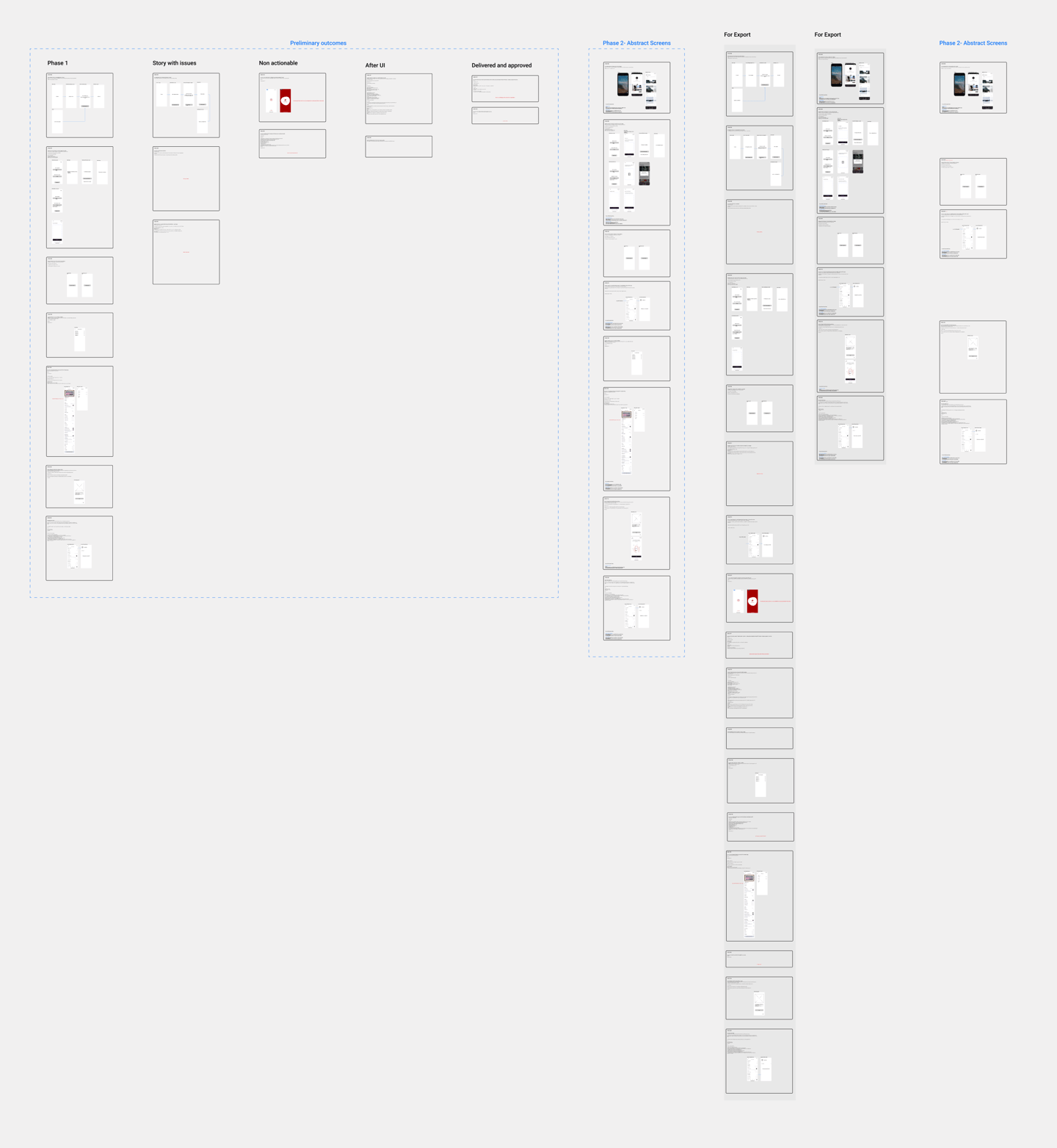
Style Guide
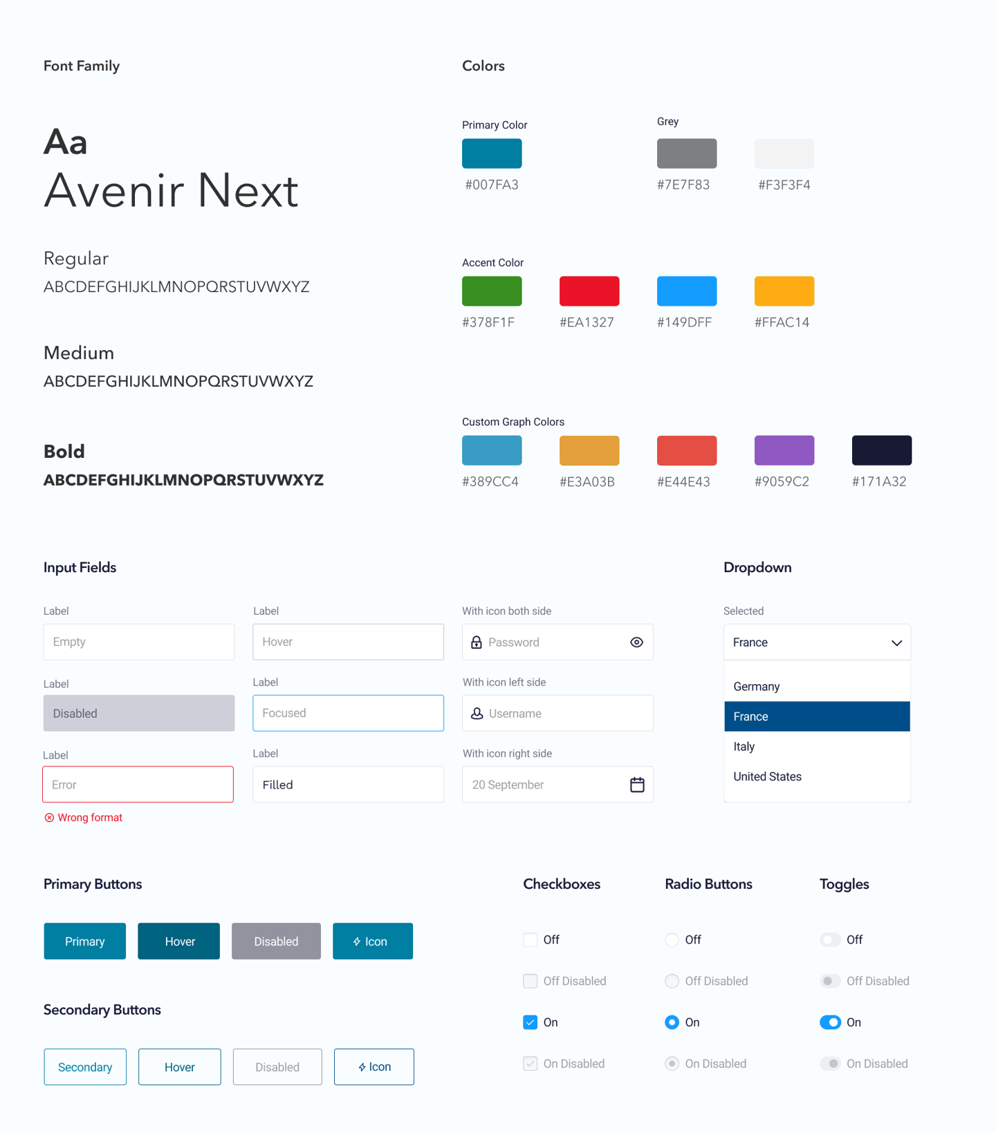
After the approval of wireframes, this was the time for the final UI design, but before jumping into that, we started defining the style guide with the help of Atomic design principles, this style guide consists of several reusable components that can be used to design layouts.
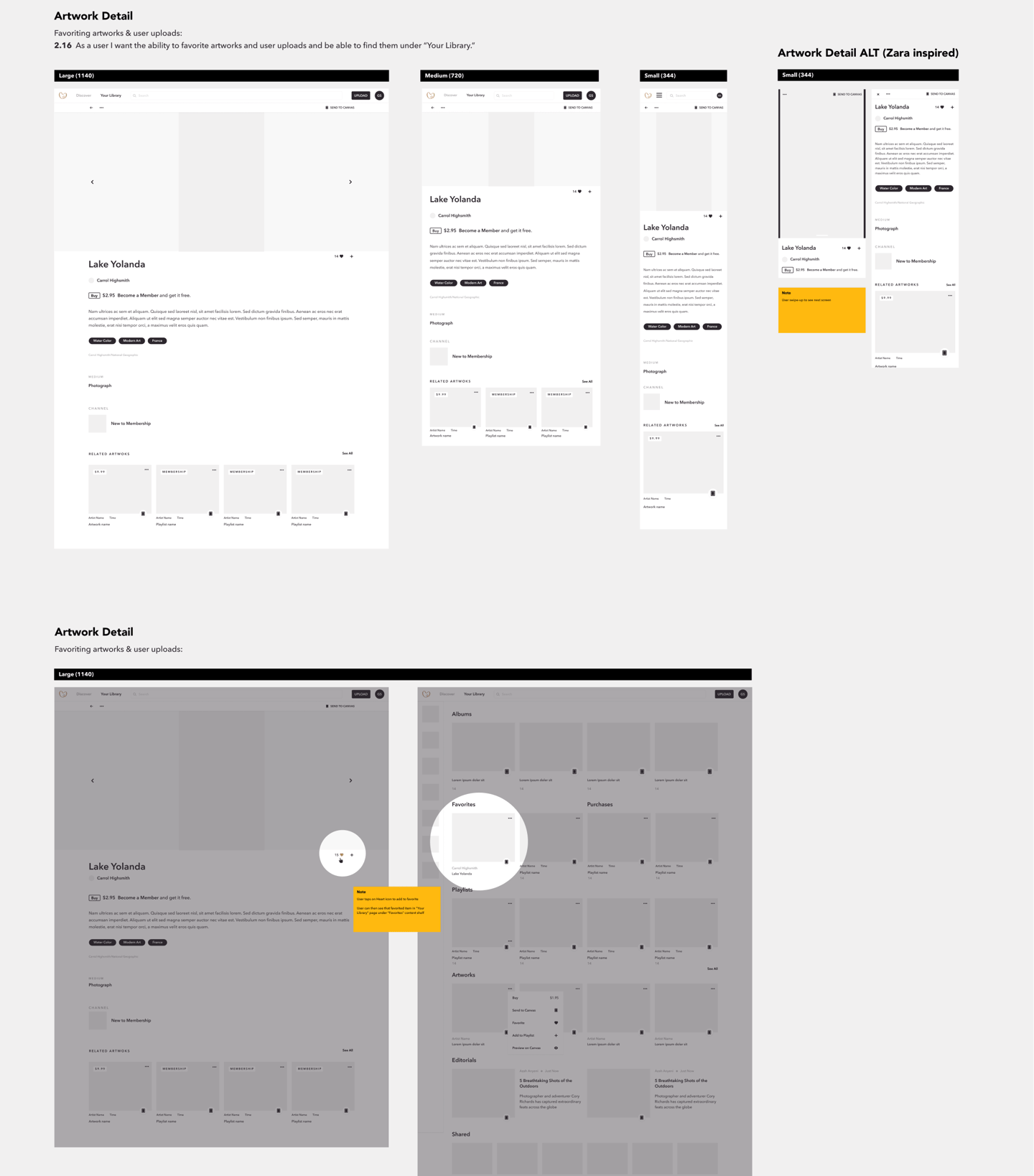
Final UI Design
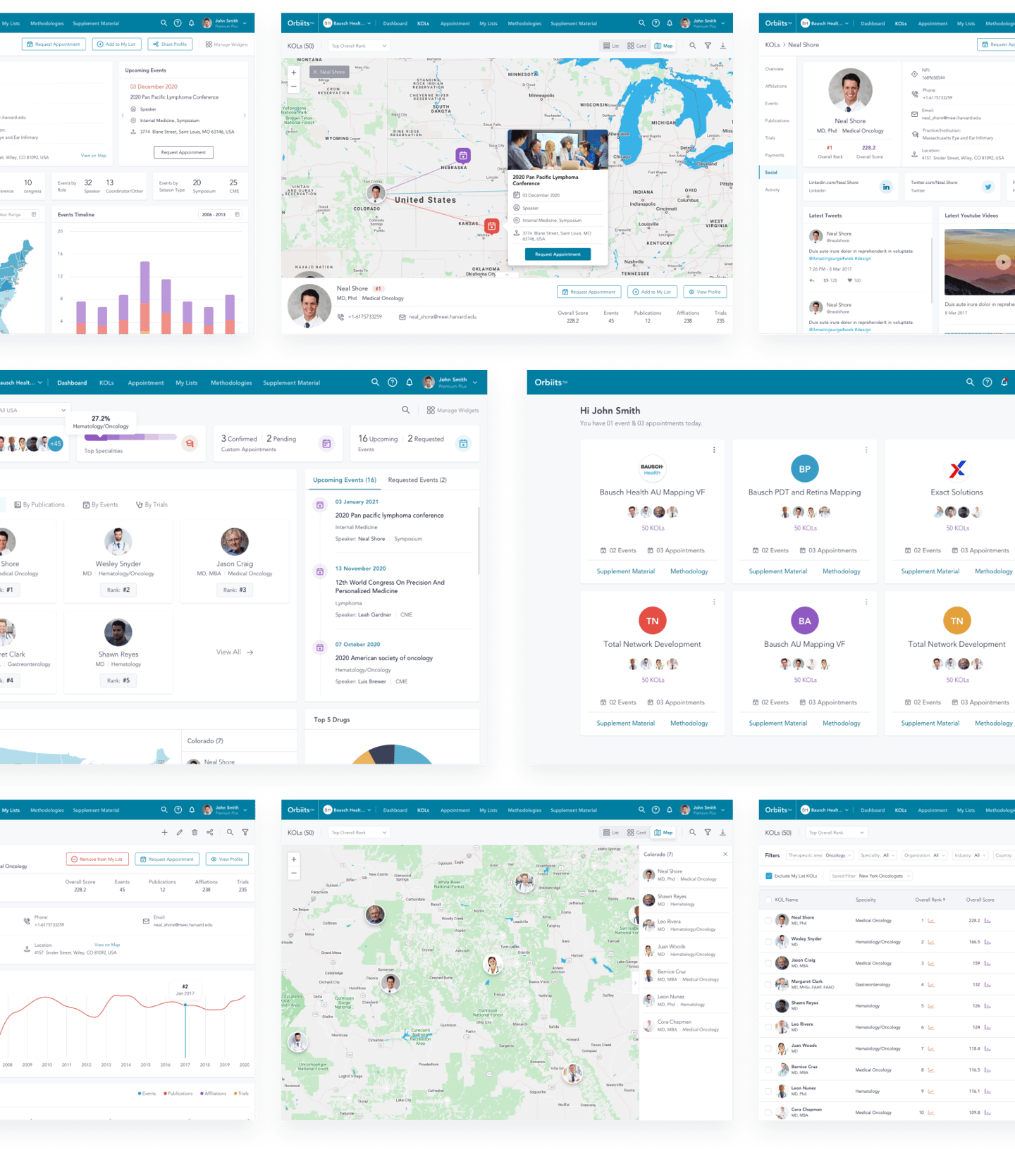
The Atomic design library which we prepared helped us create the layout quickly and efficiently, along with the consistency throughout our designs.
Usability Testing
We forwarded these prototypes to the larger audience in the Jolt, and some of the executives who are going to use this product - the end-users.
This was a self-recorded usability test, and after analyzing those recordings, we got a piece of good news as there were only a few minor updates in the design related to UI elements, and they are happy with the solution.
We implemented their feedback in the design, and started preparing for the developer hand-off.
Interactive prototype


To test these freshly crafted mockups, we created Invision based prototypes, adding every possible detail and interaction.