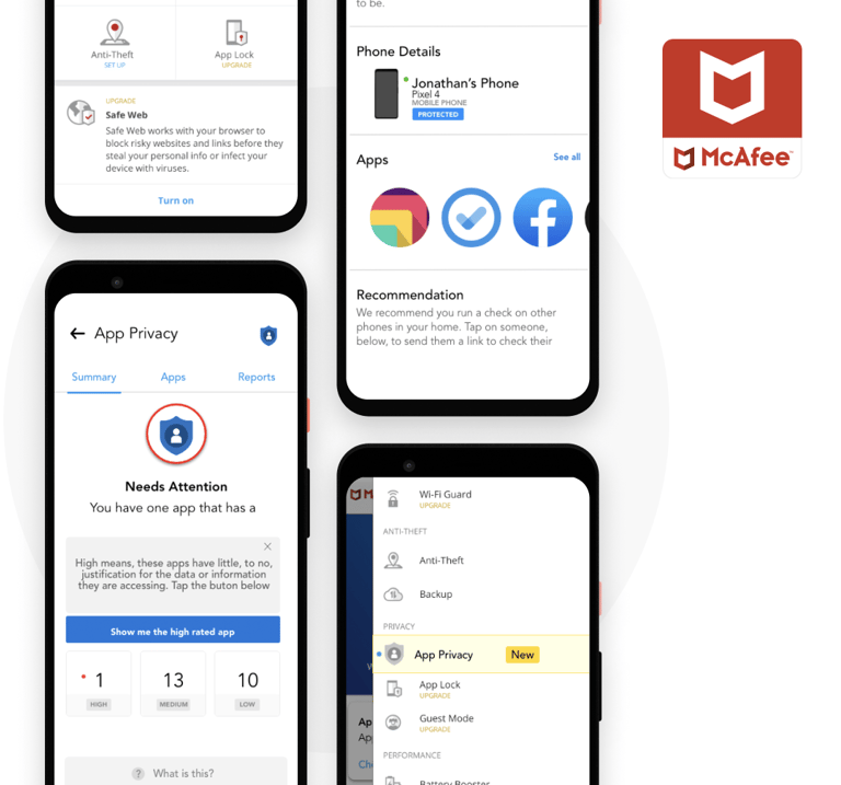
McAfee - Mobile Security
McAfee - the security giant, has a product - McAfee Mobile Security (Now - McAfee Security: Antivirus VPN) which offers virus & malware protection and various features like storage cleaner, safe wifi, memory booster, etc.
Android App

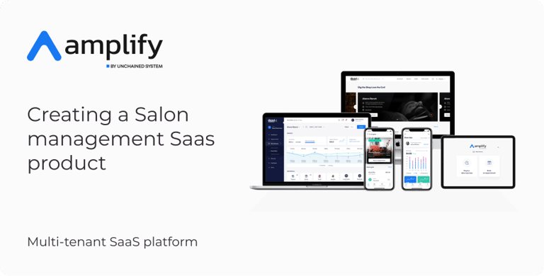
CASE STUDY
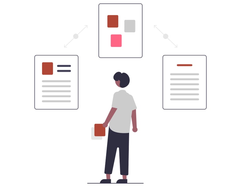
Project Overview
Objective
There is a new feature termed "App privacy check" which McAfee wants to introduce to their partner NTT Docomo Japan users and that was earlier designed by a different design team, but somehow the final results were not per the expectations. To overcome this, there is a need to carefully examine the existing flows to look out for the grey areas plus enhance the user experience using the existing design guidelines on a tight deadline.
Duration
8 Weeks (Dec 2019 - Feb 2020)
My Role & Responsibilities
My Role: UX Designer, my responsibilities, and tasks include - creation of user flow, information architecture, wireframe, and prototype.
Team
The team consists of 3 members - 2 UX Designers & 1 UI Designer
Disclaimer: Due to non-disclosure agreements with McAfee, I am limited in the amount of work I can show.
Tools Used
Figma - For Design, IA, flows & prototype
Sketch - We got the files in sketch which we have to migrate to Figma
Zoom - For communication
Creation of new user flows for its mobile-based antivirus solution within tight deadlines.
McAfee required us to act quickly and absorb their existing design guidelines & user flows thoroughly.
They didn’t want to affect the quality of the output just because they were outsourcing.
Incorporation of critical information about the system’s security state & trigger immediate user action
Challanges
Solution
We carefully examined the ongoing flows and looked for grey areas as we went through.
Next, we devised a strategy to quickly create the user flows as per the use cases provided.
A robust information architecture creation for ‘App Privacy Scan’ — a primary feature of the app that needed special attention.
McAfee liked the IA that was proposed and agreed to implement the tweaks made in designs and existing flows by us. Afterward, we delivered the design flows adhering to the current guidelines and incorporating some clever innovations, which lead to a better UX for the McAfee users. We went the extra mile by manually extracting the redlines and icons for development handoff, thereby making the job of McAfee developers much easier.
As we have to introduce only a single feature in the app, and there is the availability of the existing design guideline and user flow we decided to go with the Lean UX method: think-make-check.
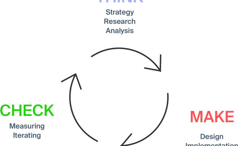
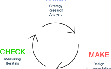
Design Approach: Lean UX Process
Existing Solution Analysis
Think
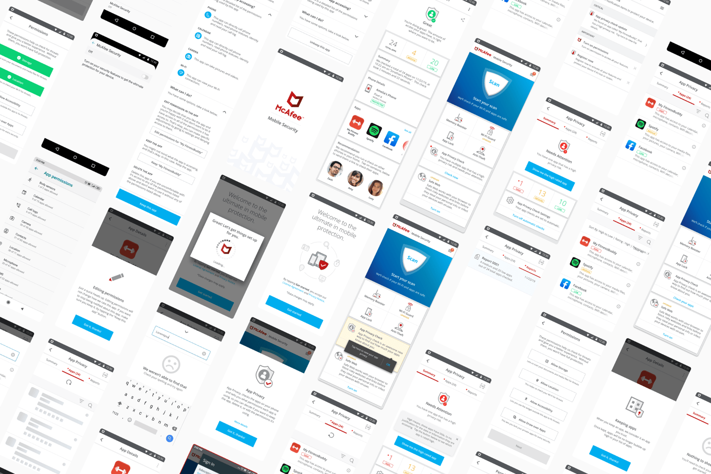
In this process, we started analyzing the current app flows, we found several issues, grey areas, and loopholes.
Existing solution analysis
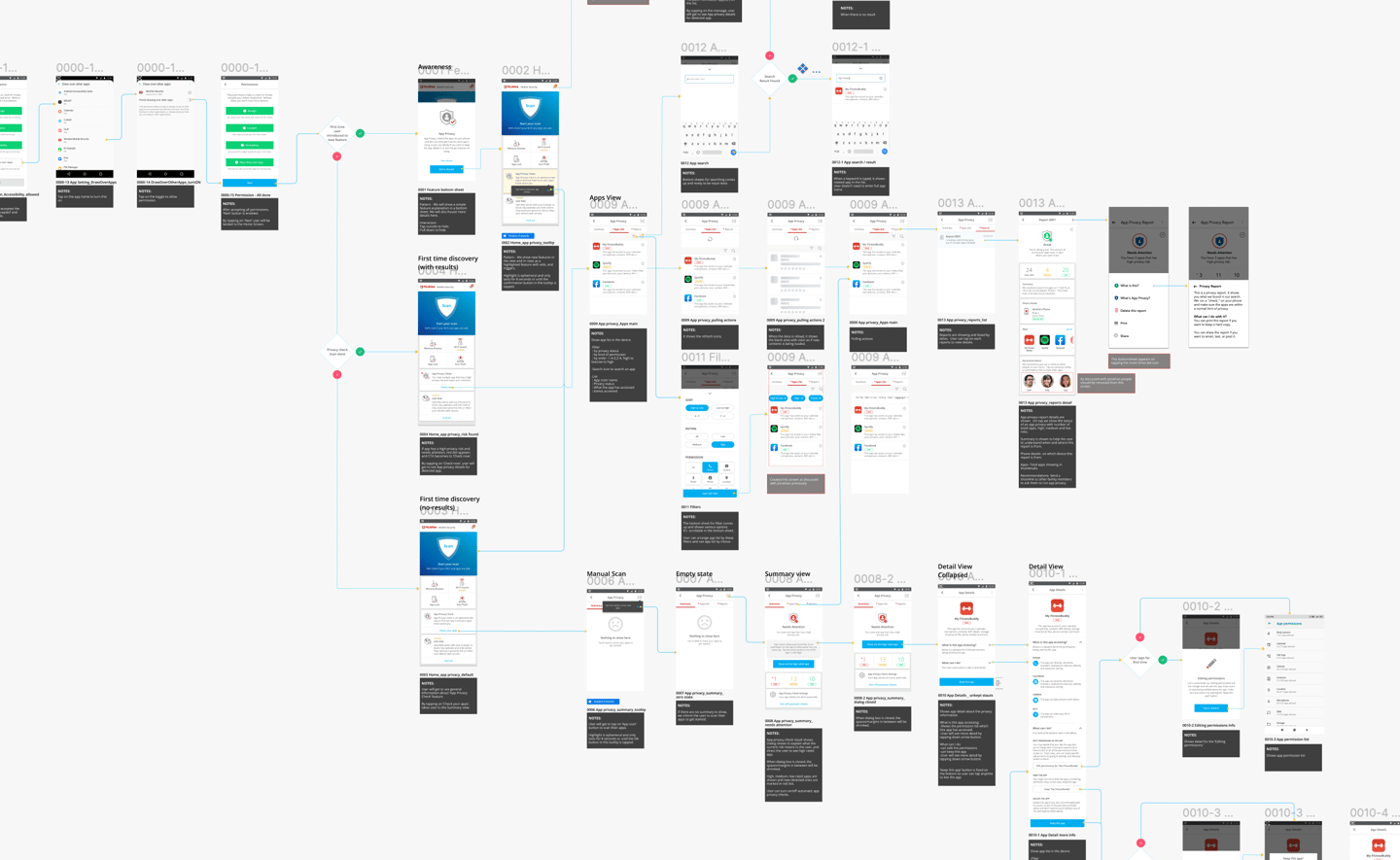
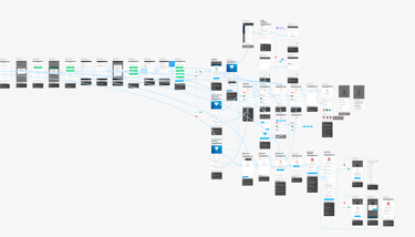
Existing App Flows
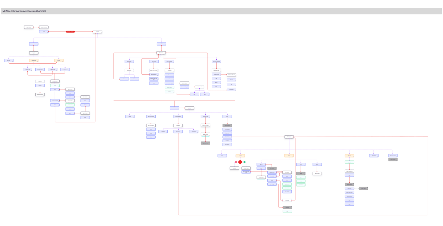
Existing Information Architecture
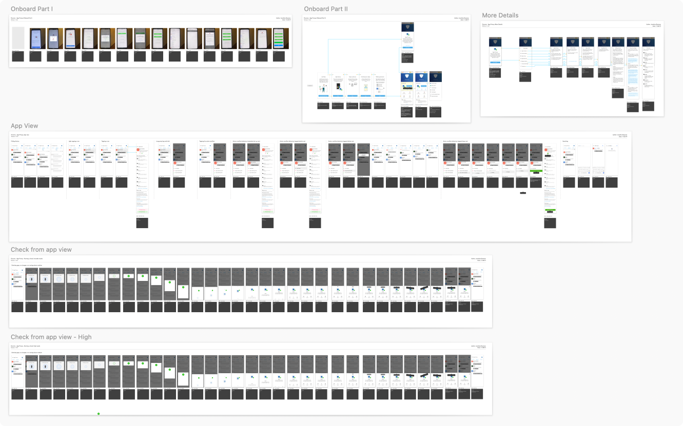
Information Architecture | Hi-Fi Wireframes & App Flows
Make
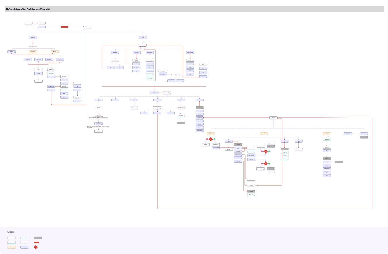
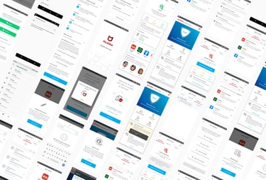
We started fixing the issues we found in the previous step by creating a new and improved information architecture, with a major focus on the integration of a new feature - App privacy check.
Information Architecture
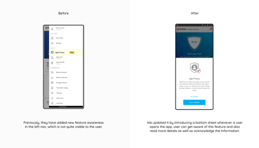
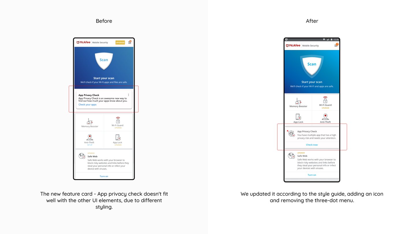
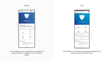
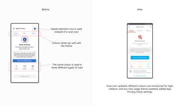
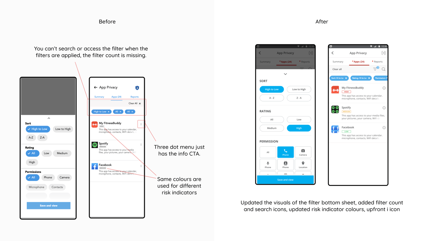
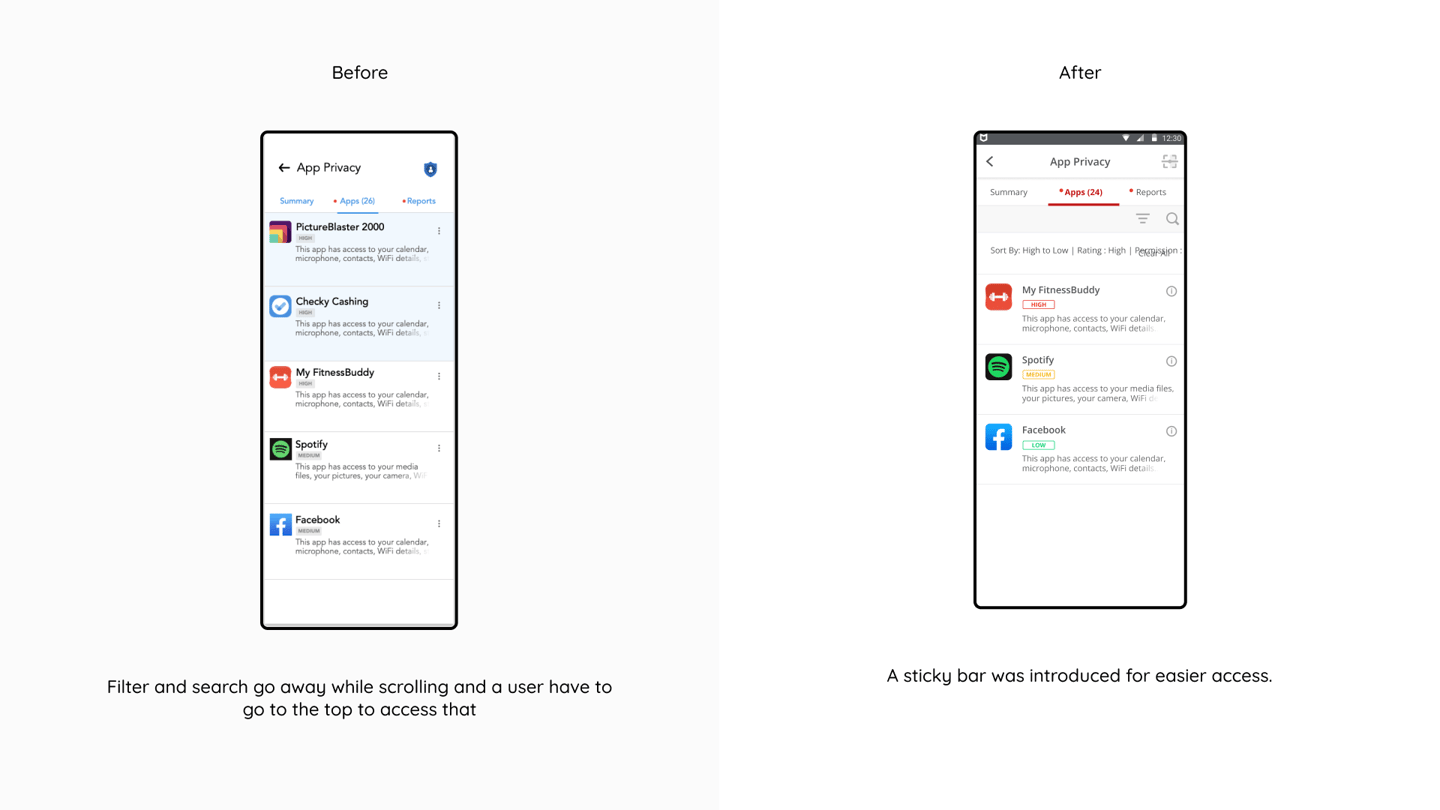
We started updating the wireframes with the solutions, I have added a few before and after screens for the comparison of what we have improved
Wireframe


To help the devs and stakeholders, we prepared the app flows which include a description of updates and use cases.
App Flows
Prototype
Check
To give a better understanding of the proposed solution we prepared an interactive prototype on Figma, the prototype helped the McAfee team to test it with the users.
Interactive Prototype

What I learned
How to work in a tight deadline
How minor things affect the overall user experience and intuitiveness of the app
The importance of a style guide and design system in a product
Key Takeaways
View my more work
Loved it? There's more